- cross-posted to:
- [email protected]
- [email protected]
- cross-posted to:
- [email protected]
- [email protected]
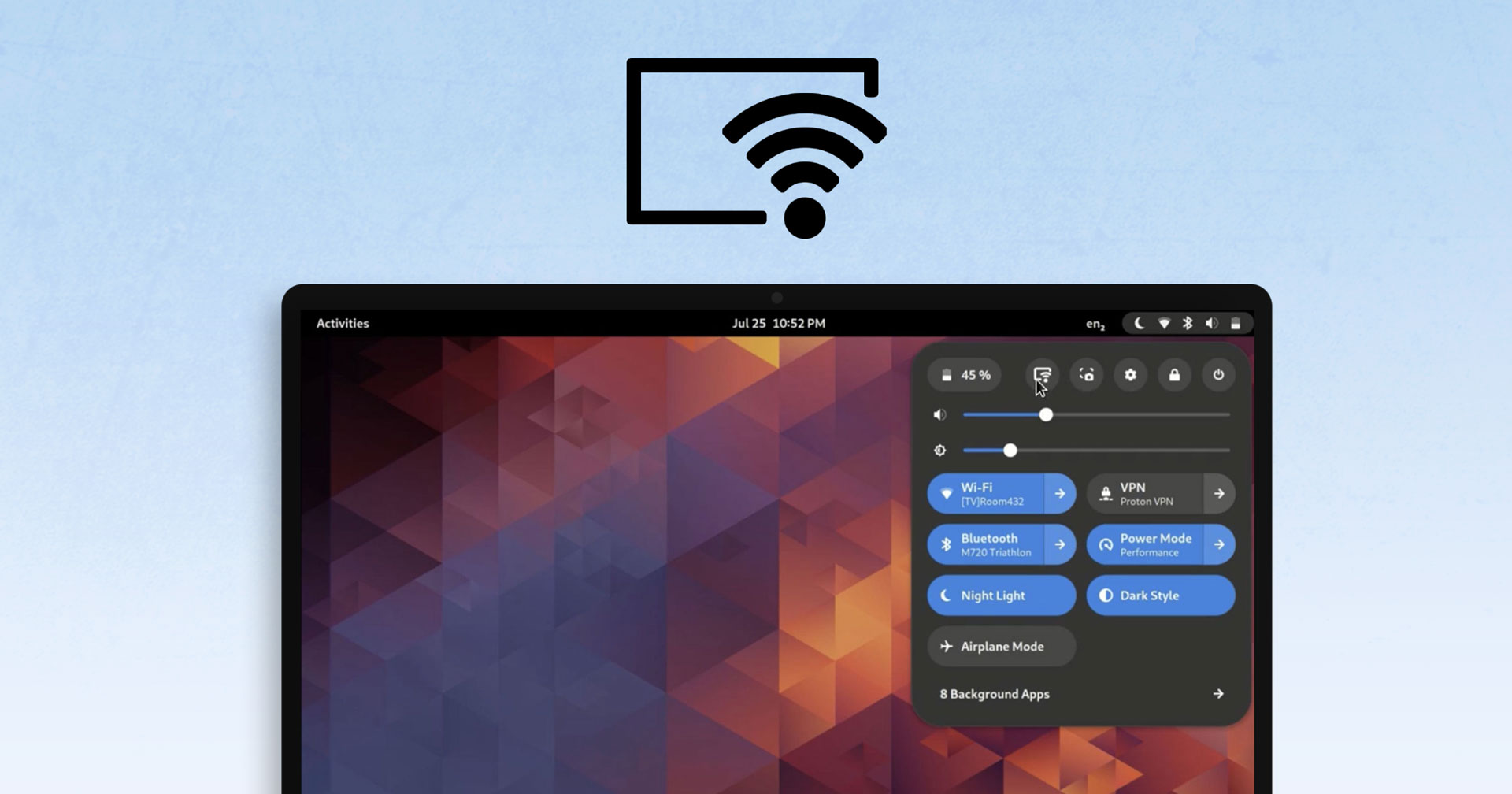
The developer working on integrating network display functionality into GNOME Shell shared short video clip to the GNOME sub-reddit […] the feature adds a “screencast” button to the row of actions in the Quick Settings menu. Clicking this opens a modal picker where the user can select any Miracast or Chromecast compatible displays on the network.


I really like gnome but those giant buttons doesn’t look good.
Just sharing a recent positive experience with bigger buttons: I just did some remote support because a printer wouldn’t work. RustDesk worked great and thanks to the bigger buttons clicking them with awful latency wasn’t so bad.
Yeah I guess they are practical and easier to push. There is always pros and cons. :)
My nitpick with those menus is how close the pop up menu is to the top panel and right edge of screen. I’d love to see some space between there.
I find this argument to be one of the most intellectually and technically dishonest ones against GNOME. With a few clicks on internet, you can download and use any good GTK3/4 theme like GNOME Professional, Nordic or Qogir. See the Fonts and Tilix/Terminal title bars.
GNOME’s custom scaling is not just most polished, but the most compact of all DEs (tried KDE, XFCE and LXQt), with the top bar taking a whopping 18 pixels of space on a 1366x768 display. And I did not even need to touch a configuration file, ever.
My machine setup