- cross-posted to:
- [email protected]
- cross-posted to:
- [email protected]
Earth’s hottest recorded year was 2023, at 2.12 degrees F above the 20th-century average. This surpassed the previous record set in 2016. So far, the 10 hottest yearly average temperatures have occurred in the past decade. And, with the hottest summer and hottest single day, 2024 is on track to set yet another record.
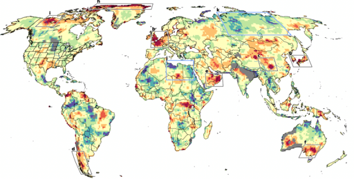
All this may not be breaking news to everyone, but amid this upward march in average temperatures, a striking new phenomenon is emerging: distinct regions are seeing repeated heat waves that are so extreme, they fall far beyond what any model of global warming can predict or explain. A new study provides the first worldwide map of such regions, which show up on every continent except Antarctica like giant, angry skin blotches. In recent years, these heat waves have killed tens of thousands of people, withered crops and forests, and sparked devastating wildfires.
Something squirrelly about this chart.
I live in Western Australia where it shows grey areas bigger than some countries. The grey colours are presumably missing data, except that smack in the middle of those is the capital of Western Australia, Perth and several other populations centers.
Missing data, or a missing prediction…since the chart is showing a difference between the two. It’s possible the model for those areas had some issue. I agree it’s worth questioning.


