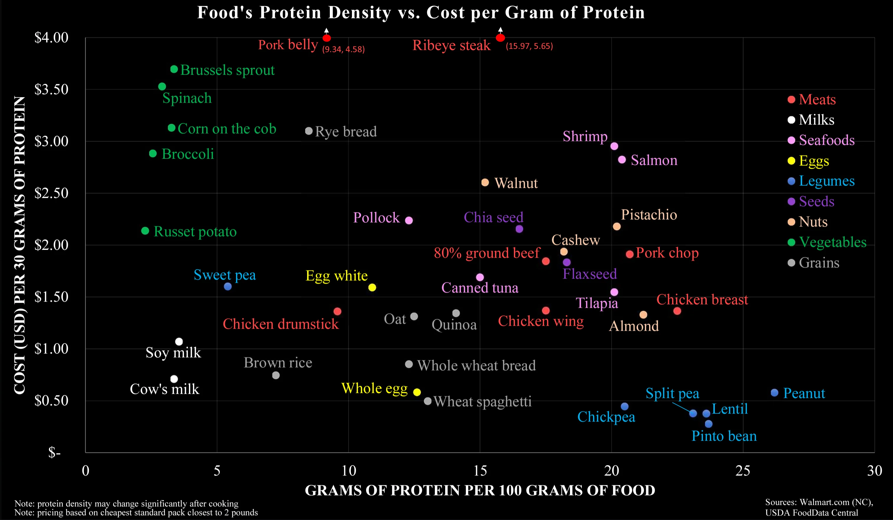
I think it’s specifically meant to debunk the idea that meat is the only affordable source of protein-dense food, when in reality there are vegan protein-dense foods that are even more affordable.
That doesn’t conflict with the fact that a well balanced diet is important; it’s just addressing one sticking point that tends to come up in these conversations.
The legumes are pretty much bs though (except peanuts) as those are dry weight, cooked weight drops Pinto beans to 9 grams of protein. Protein density drops because bean weight increases through absorption.
Nothing at all. But it reduces protein density, so makes 25 grams of protein per 100 grams weight meaningless. No one is eating uncooked, dried pinto beans.
To me it seems that your interpretation completely disregards the Y-axis. On the other hand, I wouldn’t think the colour coding does a good job in separating along the carnivorous-vegetarian-vegan scale.


I think it’s specifically meant to debunk the idea that meat is the only affordable source of protein-dense food, when in reality there are vegan protein-dense foods that are even more affordable.
That doesn’t conflict with the fact that a well balanced diet is important; it’s just addressing one sticking point that tends to come up in these conversations.
The legumes are pretty much bs though (except peanuts) as those are dry weight, cooked weight drops Pinto beans to 9 grams of protein. Protein density drops because bean weight increases through absorption.
What’s wrong with reducing density through absorption (of water)?
Nothing at all. But it reduces protein density, so makes 25 grams of protein per 100 grams weight meaningless. No one is eating uncooked, dried pinto beans.
This is not a problem with the nutrition of foods, it is the metric that is poorly designed. One more argument against the chart
To me it seems that your interpretation completely disregards the Y-axis. On the other hand, I wouldn’t think the colour coding does a good job in separating along the carnivorous-vegetarian-vegan scale.
It’s not that they are separated on the chart, but that they are comparable (on both axes), that impressed me.