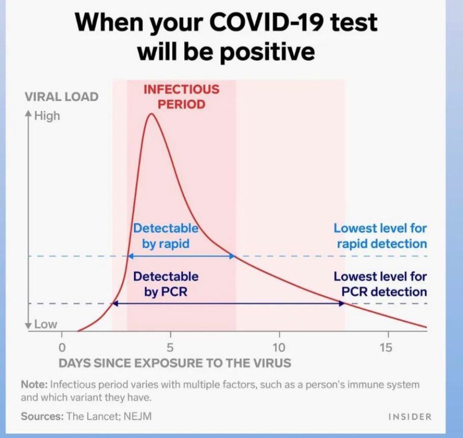
Well the axis isn’t labeled, so it could be log scale. It could also be any random range chosen by the graph maker. It looks linear though.
Quantitative just means that it is represented in numbers. It doesn’t have anything to do with the scale used on a graph. Log scales do work better for analysis and deeper understanding of population data (like virus loads), but they are much less intuitive for most readers. These are absolutely quantitative data.
So it could have been : semi-logarithmic graph
“In science and engineering (…) a semi-logarithmic plot/graph has one axis on a logarithmic scale, the other on a linear scale.”
But here : 1 one axis has the scale : “low … high” (which is qualitative), 2 the other has a linear scale (which is quantitative).
so in this case and in this context : semi-quantitative seems fitting(?).


Well the axis isn’t labeled, so it could be log scale. It could also be any random range chosen by the graph maker. It looks linear though.
Quantitative just means that it is represented in numbers. It doesn’t have anything to do with the scale used on a graph. Log scales do work better for analysis and deeper understanding of population data (like virus loads), but they are much less intuitive for most readers. These are absolutely quantitative data.
virus multiplication is quite logarithmic … i could find supporting data, but i am sure you know this already.
No need for supporting data. Virus populations definitely have exponential growth. I was just being pedantic about what quantitative means.
So it could have been :
semi-logarithmicgraph“In science and engineering (…) a semi-logarithmic plot/graph has one axis on a logarithmic scale, the other on a linear scale.”
But here :
1one axis has the scale : “low … high” (which is qualitative),2the other has a linear scale (which is quantitative).so in this case and in this context :
semi-quantitativeseems fitting(?).Ah, I see where you’re coming from.