
You must log in or register to comment.
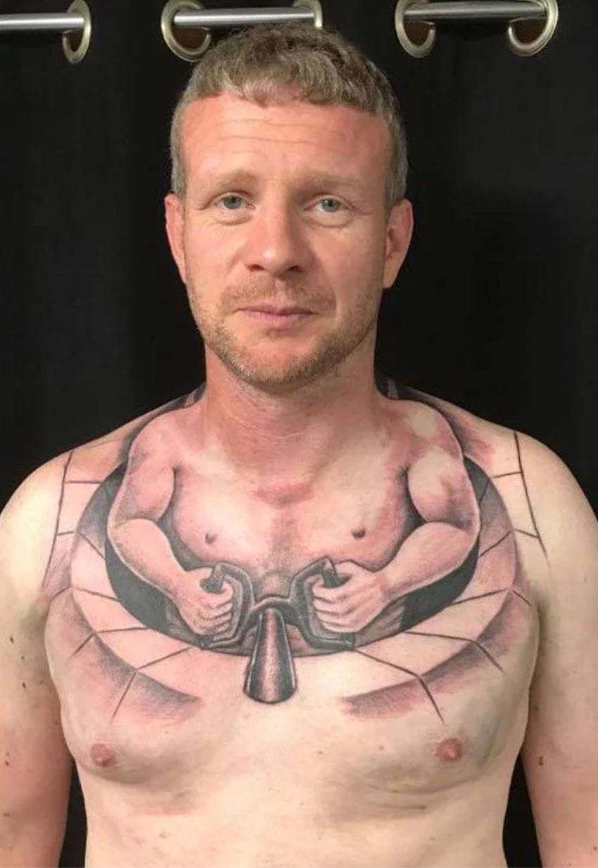
It took at least 2 people to make that error.
No Ragrets
Bad Photoshop blending on other letters…

You can tell by the pixels
Specifically, the square chunks not blended in at the top of the S and the E. It was lazy work. ‘Hoop’ was done decently, but the rest, not so much.
But yes. The pixels.
Oh, it’s from 2019, so it pre-dates AI and the obvious pixelation effect on those kinds of generated images.
Prior to 2019 all pixels were in place on doctored images
I just look at the “S” and think: Consummate V’s!
Haha, probably done by a Dutchie (hope = hoop, but pronounced the same).

