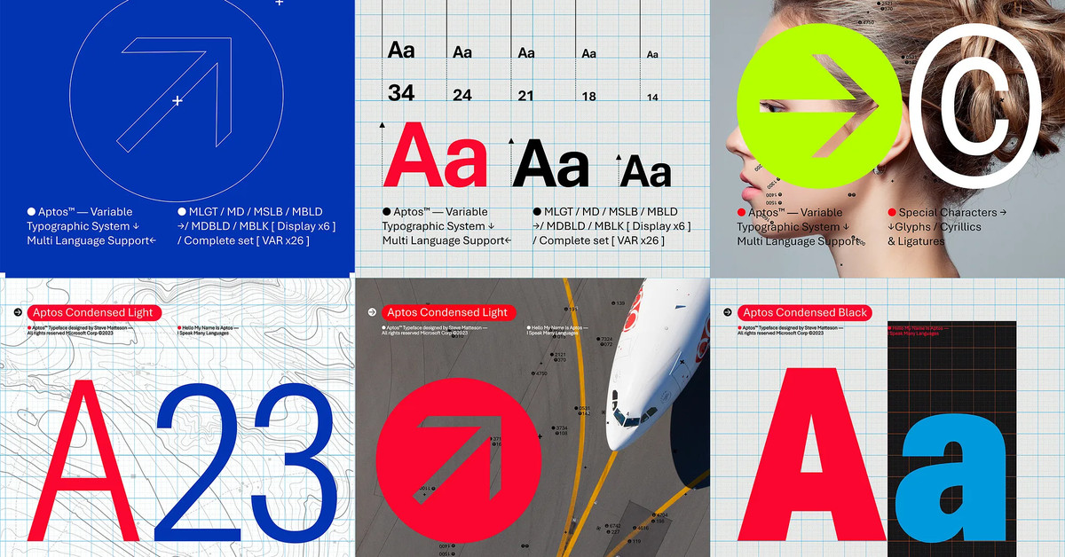
“Today we begin the final phase of this major change where Aptos will start appearing as the new default font across Word, Outlook, PowerPoint and Excel for hundreds of millions of users,” explains Si Daniels, a principal program manager at Microsoft, in a design blog post today. “And, over the next few months it will roll out to be the default for all our customers.”“Today we begin the final phase of this major change where Aptos will start appearing as the new default font across Word, Outlook, PowerPoint and Excel for hundreds of millions of users,” explains Si Daniels, a principal program manager at Microsoft, in a design blog post today. “And, over the next few months it will roll out to be the default for all our customers.”
I’m not sure I understand why they want to replace Calibri, but I guess a fresh typeface every now & then isn’t a bad thing.
What do you all think of this Aptos?


Wait, is Microsoft’s current “fluid” design language considered neo skeumorphism? (Also thanks for sharing the term neomorphism with me! I hadn’t heard it shortened like that!) I haven’t really followed Microsoft’s ui design at all, I wasn’t aware it fell into that category
Fluid is neumorphism and glassmorphism having a baby. Elements have depth and transparency but there’s still some abstraction from skeumorphism because we’ve gotten used to computers a bit more but we want textures again.
Huh, I guess I’ll have to go take a look at fluid again, I hadn’t really followed it at all since it was first being talked about as their new design language. Thanks for filling me in!