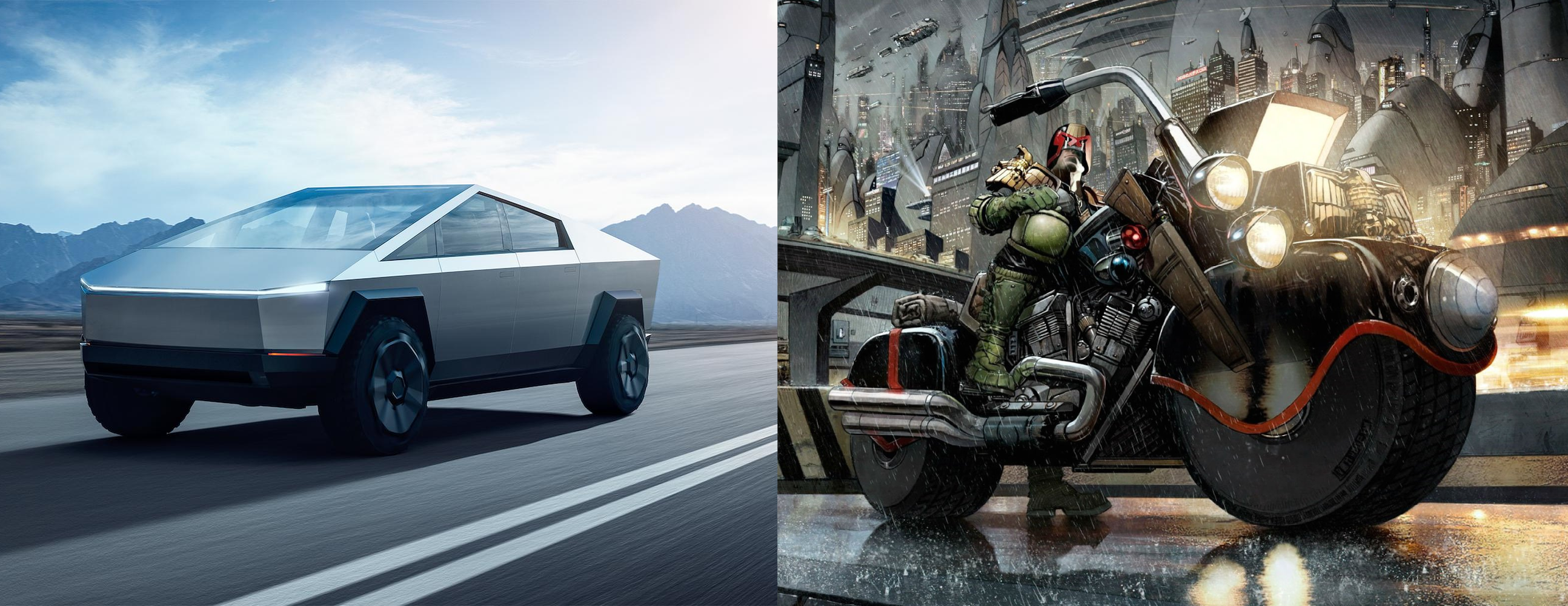
It… really does not. The cybertruck looks like the sad compromise of a too low polygon budget for a 80s game. The JD aesthetic is robust (*) and thick, sure, but not minimalistic.
(*) to which I mean the extent in that the Cybertruck looks robust.
Which is just a classic musky thing to do. Say some BS that barely passes the “as long as you don’t know anything about what I’m talking about, then it might sound right!”-test, and simps abound to make the bullshit asymmetry even more asymmetric.
PS: I’m sorry. I have blocking filters for “Elon” and “Trump”. Too many fucking morons with megaphones these days.
The cybertruck looks like the sad compromise of a too low polygon budget for a 80s game. The JD aesthetic is robust (*) and thick, sure, but not minimalistic.
And, like a lot of Carlos Ezquerra’s designs, the early Mega-City One aesthetic was very rounded and organic (“bubbly” even).
Nah, it looks like someone wanted to design a car but realized curves are complicated and hard to draw and model.
Judge Dredd aesthetic is brutal but aggressively practical, with function deciding form. The cybertruck was made in reverse, with a design that the Tesla engineers were forced to cram a vehicle into.
That’s a very comprehensive answer, thank you. Although I have to concede that the car does suit the aesthetic of that comic.
It… really does not. The cybertruck looks like the sad compromise of a too low polygon budget for a 80s game. The JD aesthetic is robust (*) and thick, sure, but not minimalistic.
(*) to which I mean the extent in that the Cybertruck looks robust.
Which is just a classic musky thing to do. Say some BS that barely passes the “as long as you don’t know anything about what I’m talking about, then it might sound right!”-test, and simps abound to make the bullshit asymmetry even more asymmetric.
PS: I’m sorry. I have blocking filters for “Elon” and “Trump”. Too many fucking morons with megaphones these days.
And, like a lot of Carlos Ezquerra’s designs, the early Mega-City One aesthetic was very rounded and organic (“bubbly” even).
I have those filters, plus a filter for “Cybertruck”. So fed up of hearing about it.
Nah, it looks like someone wanted to design a car but realized curves are complicated and hard to draw and model.
Judge Dredd aesthetic is brutal but aggressively practical, with function deciding form. The cybertruck was made in reverse, with a design that the Tesla engineers were forced to cram a vehicle into.
It suits to the extent that Judge would blow it up for the crime of looking ugly.