

You must log in or register to comment.
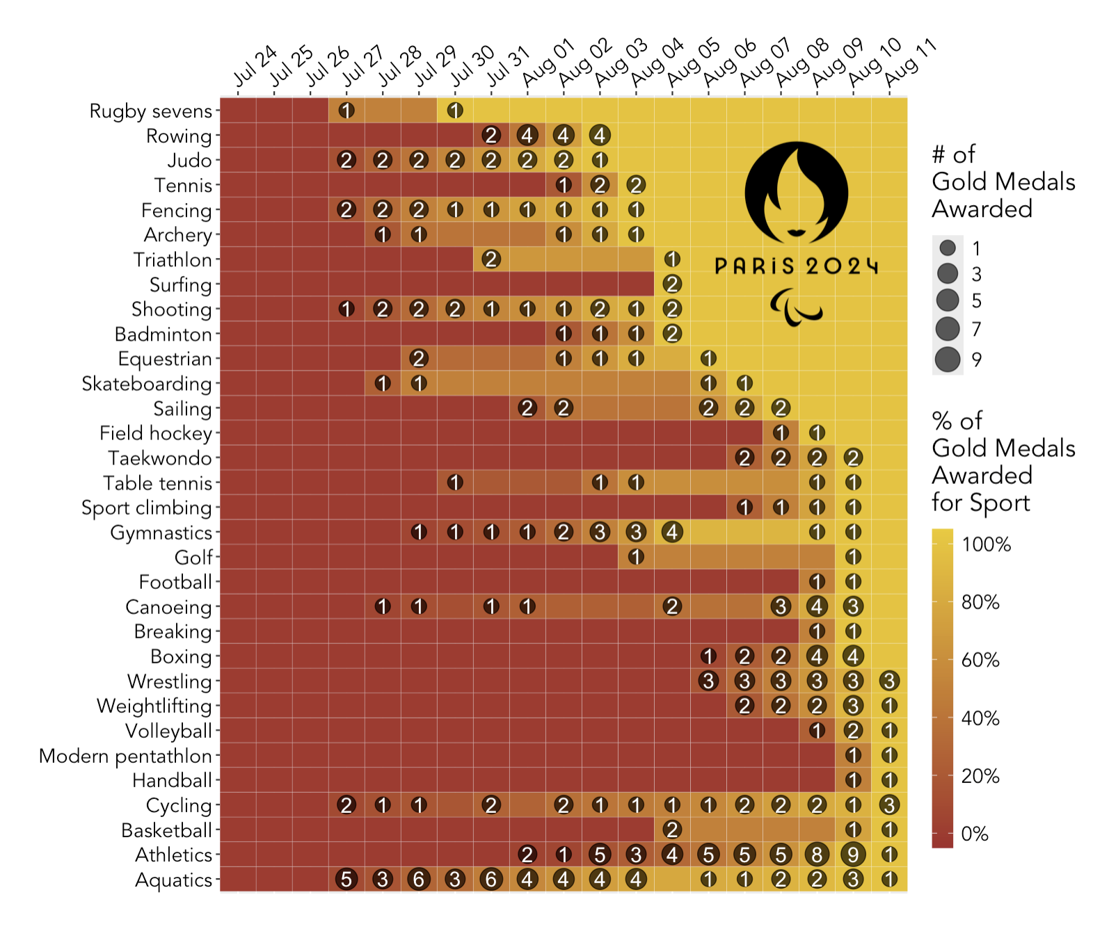
One thing that is bothering me is I can’t determine any logical way that the Y axis is ordered. Not alphabetical, not by chronological order of earliest medal awarded, not by total number of medals awarded… Just seems like a list written randomly.
I would say this is visually beautiful but functionally…ehhhhhhh
Also, there really isn’t much reason to have different sized circles with a legend when each one is going to have the number written on it anyways.
Nice to have a red chart that’s not about climate change and how the world’s going to end soon. Thank you.