
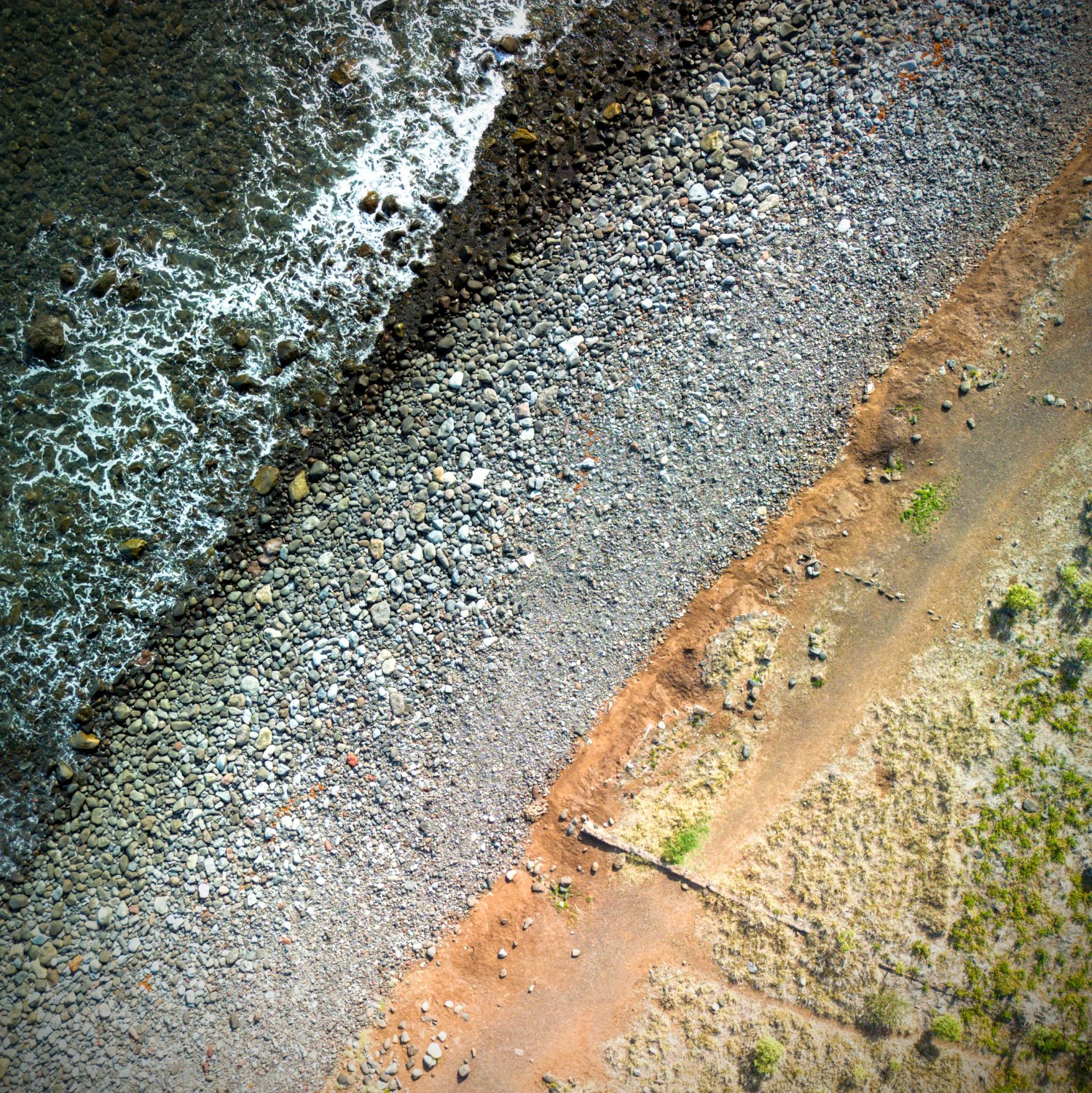
I like the clear separation of fields the image allows, with the water, wet stones, dry stones, orange vulcanic sand and finally the green fields. The center piece of the image is made up by my wife in a cyan colored shirt sitting on a white towel. However to get the shot of the color lines right I had to go up quite a bit, which makes her so tiny in the image that she does not really have any influence on the watcher anymore…
I like this a lot. Though I do think the “human” elements do detract from the desired effect a bit. Without them it’s more “abstract” and just leaves the lines, colors and textures which are fantastic.
Beautiful shot!
I took your comment and Obi’s, and combined them in the edited version below Obi’s comment.
Thanks so much for the constructive feedback and the praise!
Sure thing - it’s an excellent composition regardless of my nitpicking. I’ve struggled a bit with drone photography and this has given me ideas!
I took your comment and Obi’s, and combined them in the editing d version below Obi’s comment.
Thanks so much for the constructive feedback and the praise!
I took your comment and Obi’s, and combined them in the editing d version below Obi’s comment.
Thanks so much for the constructive feedback and the praise!
Might be more visually appealing if the lines went from one corner to the opposite.
Speaking of lines, you have some strong leading lines here that could be used to highlight something: With a composition like this, it’s good to be patient and wait until you have a subject in place that lines up with everything. If you’re the type of photographer that only takes natural shots and never sets anything up/poses subjects, it can take a while to get this, but it can be worth the wait if you ask me (plus, the more you do it, the better you get at finding the places and moments that make for great photography).
Overall, I like the shot and hope you’ll keep taking pictures!
Thanks for the elaborate feedback, it is highly appreciated. You’re definitely right about the lines getting more appeal if they went directly from one corner to the other. I’m not sure whether I understand your comment about the subject lining up everything yet. I’d totally get it if the lines were leading somewhere, but struggle to lead anywhere with them being all parallel… I’ll ponder it some more and will try different approaches to the topic of a subject when I’m out taking photos the next time, thank you so much!
Not a photographer here. Just here to say: Niiice
Thank you :)
I’d clone out the “subjects”, I’d also give this a little bit of extra pop (vibrance etc) but add a strong, very soft vignette.
 Like this?
Very nice! I love the colours and the textures in this shot with the strong lines.
-
Like this?
I like it, but my eye is drawn to the center of the image, and it kinda looks like a pile of rubbish. I’d lose this subject (and clone yourself out) because it isn’t really recognisable and play with the crop to make those lines work a bit harder. At the moment they’re not really doing much. Square crop might work well if you don’t have a wider shot to give you more flexibility.

![Beach lines [feedback appreciated]](https://lemmy.world/pictrs/image/7acb3bd1-7c72-4b0f-869a-a9bc96c9bbaf.jpeg)