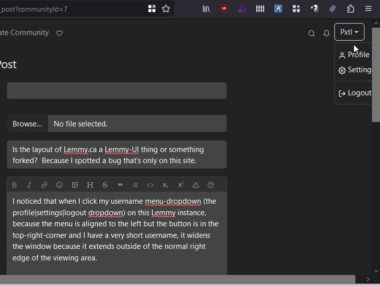
I noticed that when I click my username menu-dropdown (the profile|settings|logout dropdown) on this Lemmy instance, because the menu is aligned to the left but the button is in the top-right-corner and I have a very short username, it widens the window because it extends outside of the normal right edge of the viewing area.
Here, let me show you what I mean:

note the overflowing dropdown box and horizontal scrollbar. That horizontal scrollbar only appears when the menu is visible.
I was going to log a bug in lemmy-ui, but then noticed that this doesn’t happen on my other account on sh.itjust.works. Then I realized the difference: sh.itjust.works has a massive amount of wasteful padding on the sides, and over a maxwidth it just centres the whole site. Meanhwhile lemmy.ca uses the full width of my browser window.
First, I want to say: Thanks! Please use my screen to the fullest extent instead of wasting it on empty bars. If I wanted a narrow view, I’d shrink the browser window.
But I’m curious, is this customization something built into Lemmy or an unsupported tweak to the Lemmy code. That is, should I still log my bug on Github?
edit: confirmed can repro on narrower window on sh.itjust.works, logging bug to github.

We don’t run any customizations (yet), so yeah just go ahead and report it at https://github.com/LemmyNet/lemmy-ui