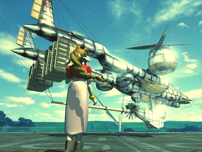
Is it just nostalgia or does anyone else prefer the old one?
Aerith undoubted looks better but I think I prefer the look of the old High Wind.
I agree. The new one looks like it’s made with better technology out of a different material too . All the newer FFVII stuff has always made the world and technology seem a little more sleek and advanced than the original did which bugs me a bit every time.
That whitish green tint really adds to the dreamlike quality of the image too as it’s not a “real” thing that could’ve happened in the game.
Yeah that was something I noticed too. Though structure and designs are similar, the styling of the panels brings something to it. It’s the very aviation era, Art Deco panelling, where as the newer one somewhat lacks that. However I do like the new one.
I much prefer the old one. I have a print of it framed in my office
deleted by creator


