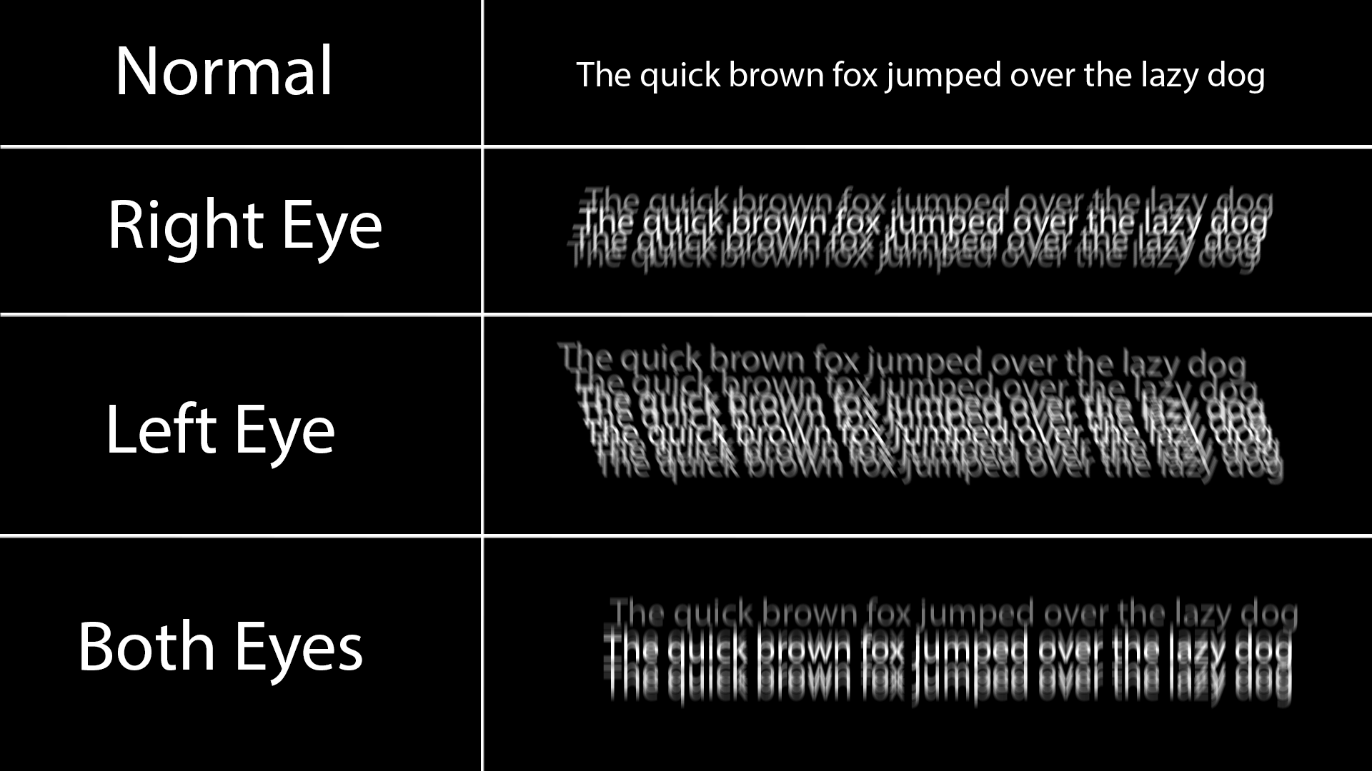
I have astigmatism and white on black text looks like this to me:
The ghosting is always light to dark, so black on white text ends up looking maybe a little grey on the edges but much more comfortable.
White on black also causes persistence issues with my eyes, after reading a lot of white on black I see horizontal lines when I look away or even just change position of the phone, making the ghosting even worse.
Dark mode looks much better, but causes issues with accessibility for some eye conditions. That’s why a good accessible application should always support light and dark and ideally respect system-wide settings.
I have astigmatism and white on black text looks like this to me:
The ghosting is always light to dark, so black on white text ends up looking maybe a little grey on the edges but much more comfortable.
White on black also causes persistence issues with my eyes, after reading a lot of white on black I see horizontal lines when I look away or even just change position of the phone, making the ghosting even worse.
Dark mode looks much better, but causes issues with accessibility for some eye conditions. That’s why a good accessible application should always support light and dark and ideally respect system-wide settings.
That was an incredible diagram of what the text looks like for you.
Thank you for the information
f, i didn’t even know I had this! i too think dark mode looks nice but end up using light mode coz of eye strain.