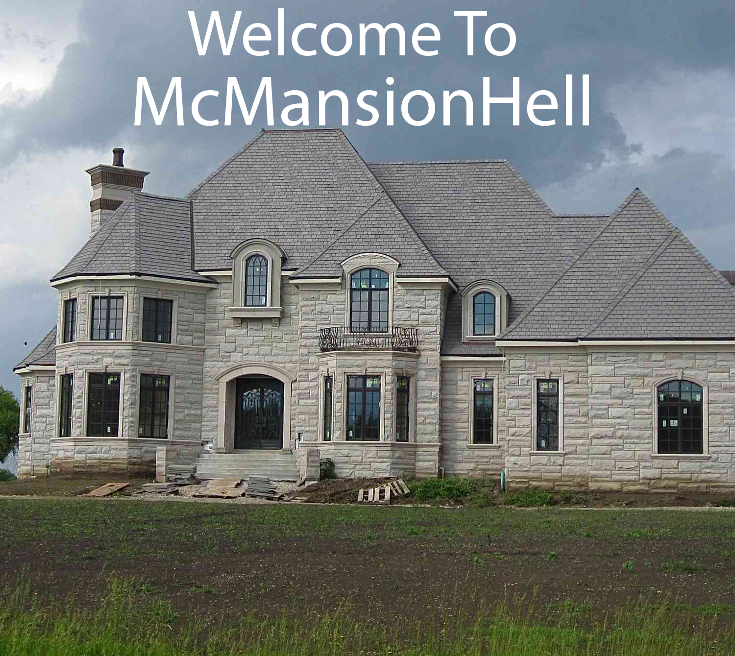
I don’t like this. >:( They could have improved what was already there, but they just made it sterile and boring
I dont think they made it worse… the first one does look a bit dated and in need of a refresh, but I dont think what they did was the answer either.
Painting that brick is criminal. Otherwise it’s just fine.
Painted brick makes me want to strangle someone
Better before. The brick gave the facade character. The “modernized” exterior is bland and weird.
Yeah, it’s literally the feature of the front wall and they made it invisible.
I think if they had painted the bricks a concrete grey, lighter than the roof and garage door it might have tied the whole thing together.
They took out a tree that had a few generations of growth with a decision that only took a moment. And to make a worse looking landscape. The house is bad enough but they decided the landscape to be just grass is appalling.
The tree in front of the house in the first picture looks dead. If it was it would explain why it was removed.
There are two trees to the side of the garage now though
The two pictures were not taken from the same angle
Before definitely looks better. I think there’s some new design trend when selling a house to paint the exterior white. Not sure if it’s so the client can imagine their own color scheme or what, but I’m not a fan.
I think it tricks stupid people into thinking a 100 year old house is somehow new because it’s white now. And it makes it feel clean and futuristic which seems to be the vibe everyone is going for but maybe sterile is in from some recent trauma.
It reminds me of a commercial building that went up about a decade ago now in my town. It’s a brick, iron and glass facade that’s meant to look like a 1910’s city building, you know kinda artsy brickwork and all wrought iron railings and such…except it’s too perfect. Everything looks machined. The windows are obviously large single panes of glass with a lattice in front of them rather than individual lights in a frame, so the reflection in the windows is too uniform, the bricks are too perfect, a lot of the details are obviously decorative instead of functional as they would have been on the genuine article. And underneath it’s a breeze block and steel girder building like every other strip mall in town, it’s just got a fancy face on it that they’ll chip off in another decade and replace with something trendier.
That is not an improvement
Not one improvement. The house is just bland and they took out all the plants. Huge step back in every way.
Nice catch with the plants. I think had they kept the bushes the house wouldn’t look so bad in the after.
Look closer. Small trees/shrubs growing there. Need time to get bigger. Big tree has big roots. Being that close to the house can seriously Jack up the foundation.
Not to mention old trees can drop branches.
Mayhem is everywhere.
I like the after more. 🤷🏻♂️
Edit: I do not like the new look for 500k more though. Double the purchase price!
Not gonna lie, I’m a fan of the black and white modern look, and I’m not a fan of the “classic ranch home look”. But I’d say the house in the first picture definitely has more of a personality to it, despite not usually liking that style. Plus, it still looked like a modern version of the classic ranch look.
Why cover the brick?
I think the idea is that these houses tend to cram multiple things together, that most people who know about design would agree just don’t go together. Brick and siding can be used tastefully, but I don’t think this home is a good example of that.
There are 3 houses on my street that did the same thing. Cover all brick with siding. White with black accents throughout. I can’t imagine it will age well, that contrast sticks out like a sore thumb
I saw a video talking about how people’s moods are worse now because the world is less colorful. In the 60’s through the 90’s they’d paint cars all manner of colors, you’d have orange carpets and avocado green appliances and whatnot. Now cars are black, grey or white, houses are white with black or steel trim, phones are black rectangles…we’ve drabbed our world.
I was wondering about this a few months ago. That the parking lot is so…dull. Every car is the same 4-5 colors. We need more color for cars.
If you recall the video I’d like to watch it.
I really liked the avocado and orange in 70s houses. It felt warm and relaxing.
The first looks like a house, the second looks like somewhere someone stores the furniture you’re not allowed to sit on.
I’m on my phone, but it looks like the brick is entirely gone, not painted? If that’s the case, it may have been a facade with rot behind it. Happened to on of our neighbors. They ultimately decided to add their brick back, but it cost as much as your would think building the front of a brick house would cost…
If you see the detail photos on the zillow listing, you can tell they just painted over the brick.
Painted brick is just sad :(
They DID improve what was there. The brick was obviously nothing more than a facade. The windows were updated to something about 35 years newer and without mullions which is always good (“Nah, I like having multiple strips of plastic in my face while looking outside!”). It looks like they replaced the door with a newer unit as well.
I mean, there’s nothing wrong here except you don’t like the colors.
Look at the zillow listing, they painted over the brick with white paint.
Agreed on the Windows. Those cross stripes also block a surprising amount of light. And they’re terrible when cleaning, effectively making your clean a lot of little windows instead of a large one.
I did renovations for a while and everyone I sold new windows to I tried my damnedest to get them away from the mullions. At the very least some companies now do mullions that are sandwiched between the panes on double pane windows. If you need to have that “I can’t see shit” look then that’s fine. I guess.
But they’re bad. So bad.
That looks creepily like my great aunts house in Raleigh when I was growing up


