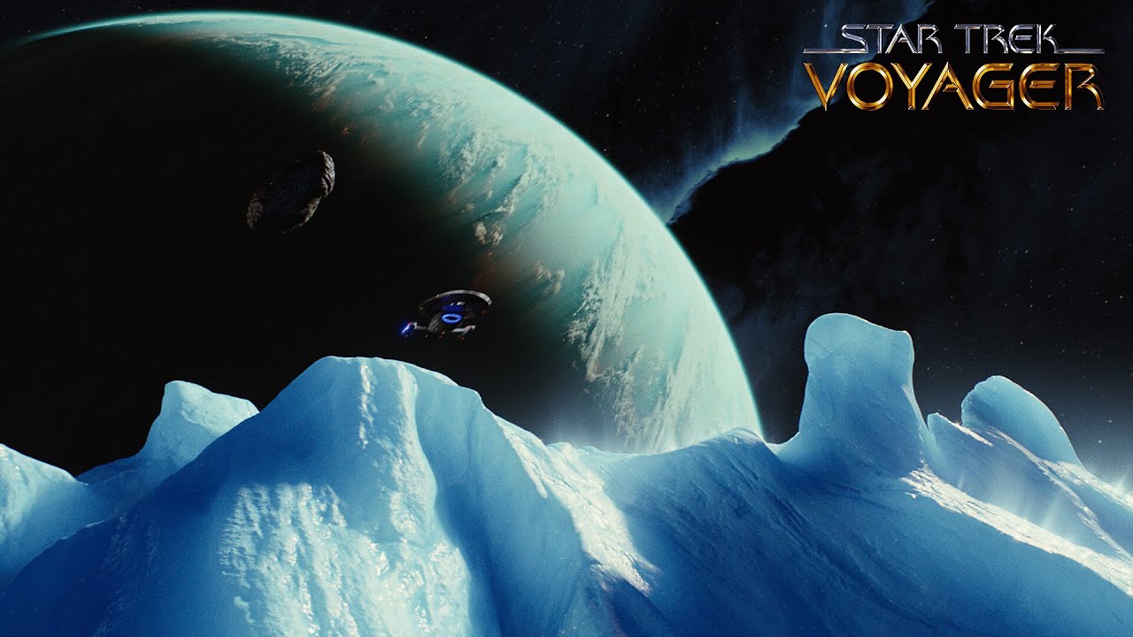
Dat ice
There is only one tiny way this could be better - in the original intro, the nebula parts just ahead of Voyager’s prow thanks to the navigational deflector. Replicate that one little bit and it will be perfect.
Also those clouds swoosh farther to the side and create these large curls toward the end :)
OMG that’s gorgeous. I tried to upscale from my DVDs and my GPU almost melted and didn’t produce anything half as good as that.
Have you tried replicating a better gpu
awesome work; it gave me goosebumps. lol
I would prefer 60 FPS over 4K, but this looks really good, anyway (:
I’ve seen 4K upscale version before. But this is different and seems definitely remastered in certain areas.
Edit: here is the 4k version. One thing different is the shadow of voyager on the rings in the remastered don’t seem to appear so making the impossibly small planet not a thing anymore.
deleted by creator
:0
i cant wait for AI remastering/regeneration of the effects from the series where they don’t have original shots anymore, or it was only generated at TV resolution in the first place.
Imagine watching the double ep Scorpion in high res :)
No fixing those proportions.


