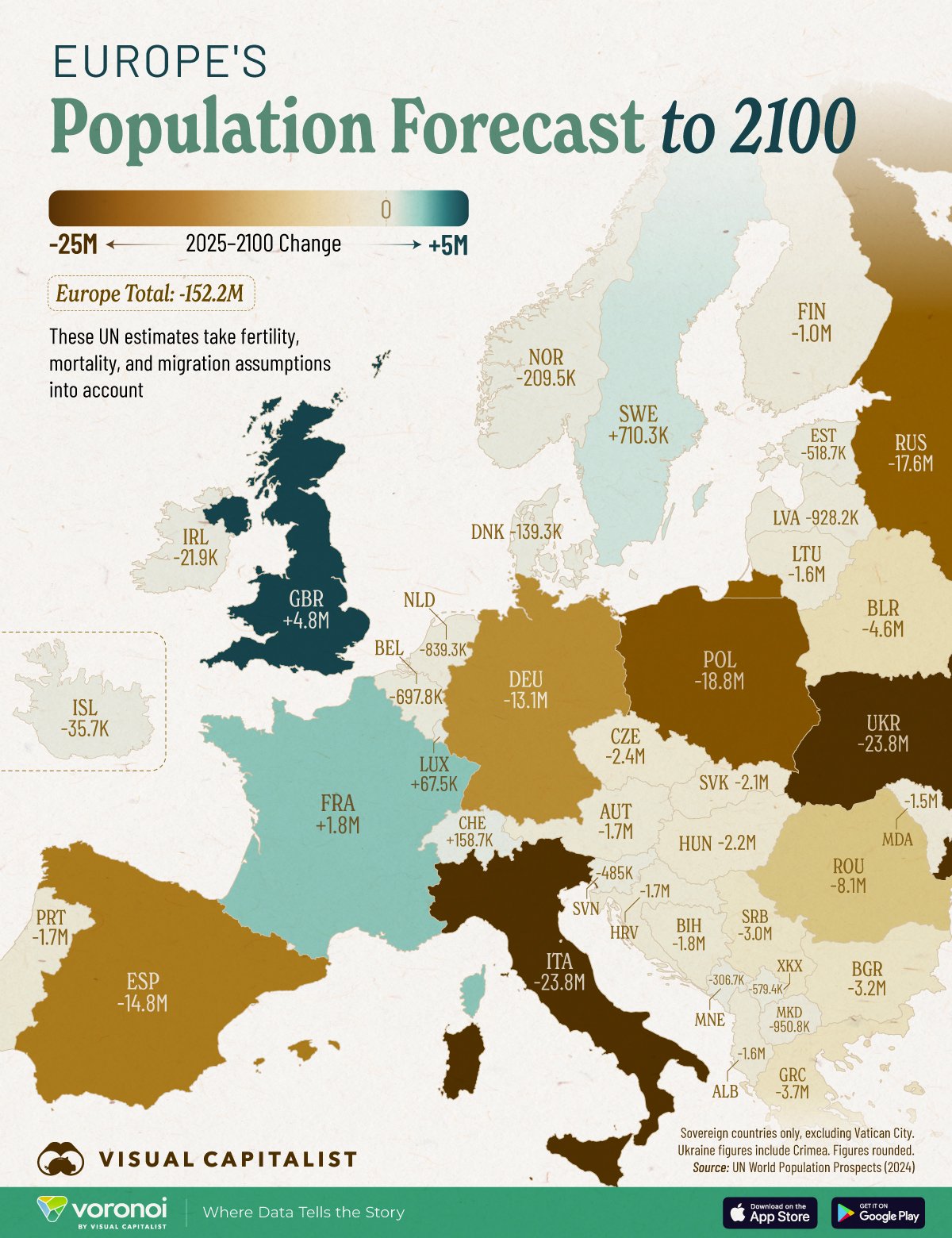
Dju@lemmy.world to Europe@feddit.orgEnglish · 2 months agoEurope's population forecast to 2100lemmy.worldimagemessage-square40fedilinkarrow-up196arrow-down120file-text
arrow-up176arrow-down1imageEurope's population forecast to 2100lemmy.worldDju@lemmy.world to Europe@feddit.orgEnglish · 2 months agomessage-square40fedilinkfile-text
minus-squarepoVoq@slrpnk.netMlinkfedilinkEnglisharrow-up21arrow-down1·2 months agoIt’s not like that the creators calling themselves “Visual Capitalist” wasn’t a dead give away that this would be based on foolish assumptions 🙄
minus-squareMelchior@feddit.orglinkfedilinkEnglisharrow-up6·2 months agoThe forecast comes from the United Nations. “Visual Capitalist” just made the graphic.
minus-squareCanadaPlus@lemmy.sdf.orglinkfedilinkEnglisharrow-up4·2 months agoVisual Capitalist makes tons of great infographics, actually. I’m not sure how nobody in this thread has heard of them.
minus-squareanomnom@sh.itjust.workslinkfedilinkEnglisharrow-up2·1 month ago2 things: This isn’t a data is beautiful or map enthusiasts community, it’s c/europe. its not the most memorable name, and has the name capitalist in it, which at this point in our late stage era is a touchy subject at best.
minus-squarefederal reverse@feddit.orgMlinkfedilinkEnglisharrow-up3·1 month agofwiw: Info graphics are allowed, as long as they’re sourced.

It’s not like that the creators calling themselves “Visual Capitalist” wasn’t a dead give away that this would be based on foolish assumptions 🙄
The forecast comes from the United Nations. “Visual Capitalist” just made the graphic.
Visual Capitalist makes tons of great infographics, actually. I’m not sure how nobody in this thread has heard of them.
2 things:
fwiw: Info graphics are allowed, as long as they’re sourced.