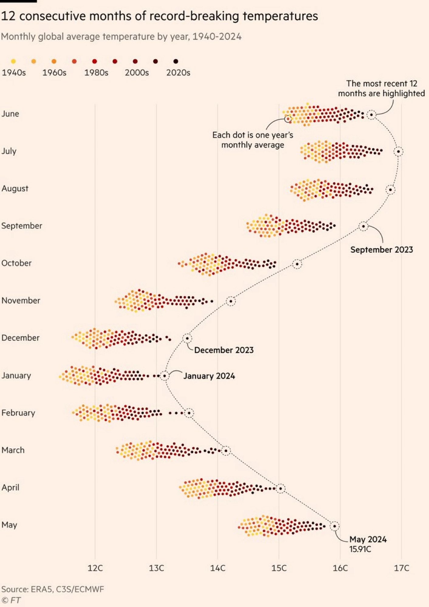
Nice graphic. Although probably you’d see more info with just a lineplot, separating north / south + land /ocean. What strikes me is how regular the gap is over the last year, and how it bulges most in July-December, which suggests the ocean (larger and less variable) dominates the numbers, with El Niño overlaid on steady warming trend. To get it back down quickly, we need more effort on short lived gases - mainly methane (tackling aviation-indeed cirrus might also help compensate for reduced ship-sulphate cooling ) .
There are layers of variability there that can’t be captured with a line plot. The data density is too high to even capture the decanal progression in a useful way, forget about monthly and annual variability . So no.