So I’m guessing you’re going for a color field painting, like Mark Rothko or Piet Mondrian style yeah? If so, great job! You’ve captured this style very well. In my personal opinion, the ‘weight’ of the top half of the painting is a bit heavy or busy versus the bottom half. I would suggest turning the painting sideways or upside down and seeing if you like it.
Holy crap you’re right. I like it better in both of those orientations. Art is crazy because you can spend hours every day painting something before someone makes you realize you’ve been holding it upside down the whole time
So I’m guessing you’re going for a color field painting, like Mark Rothko or Piet Mondrian style yeah? If so, great job! You’ve captured this style very well. In my personal opinion, the ‘weight’ of the top half of the painting is a bit heavy or busy versus the bottom half. I would suggest turning the painting sideways or upside down and seeing if you like it.
So maybe like this: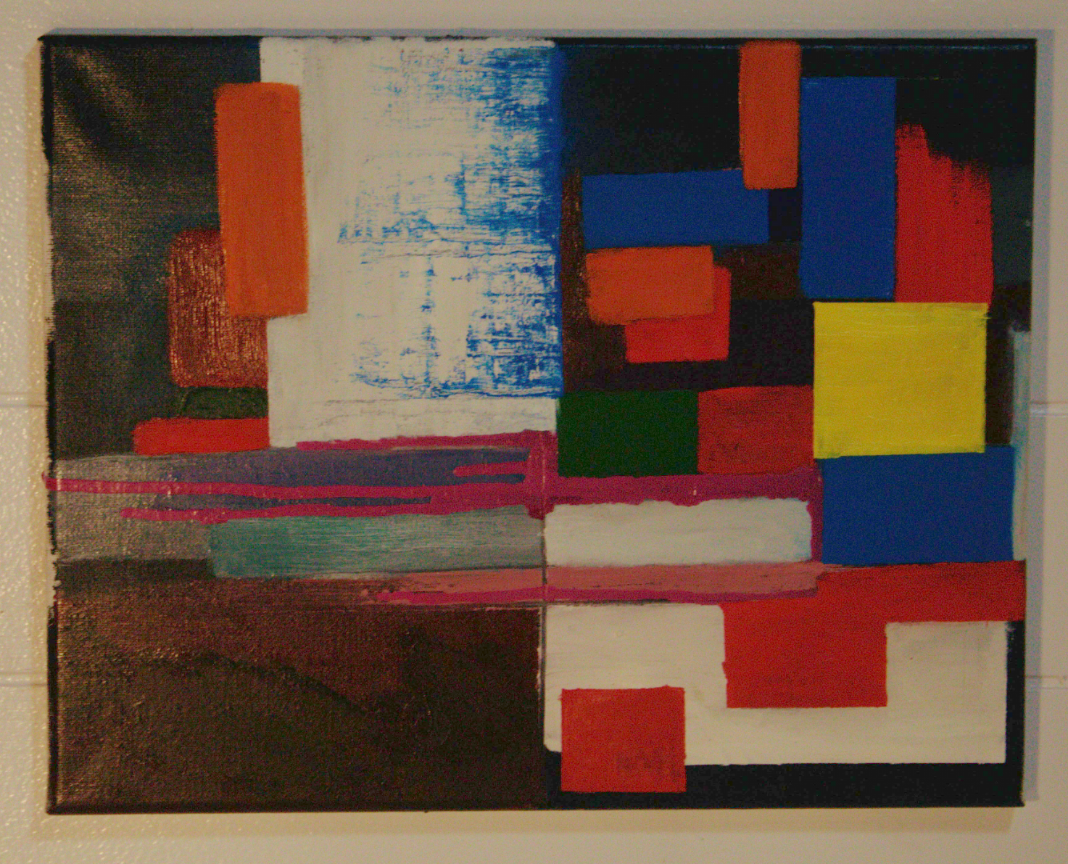
Or like this:
Holy crap you’re right. I like it better in both of those orientations. Art is crazy because you can spend hours every day painting something before someone makes you realize you’ve been holding it upside down the whole time
This is actually very cool. It has quite a different vibe depending on orientation. The first alternate orientation feels much more grounded.
I guess I shouldn’t be surprised. Good photographers also use composition techniques like this all the time, for example.
I really like it upside down. I feel like it grounds the painting. It’s a very elegant suggestion