

1·
4 days agoWorks fine on latest version.

I am rubber and you’re glue - whatever you say bounces off me and sticks to you.
Works fine on latest version.
Coming to Arctic btw~ (requested earlier, probably waiting for iOS 18 or would come eventually)
Looks like you’re someone who doesn’t read but it uses DNS filters to use revoked certificates.
May as well sideload on iOS~

Shigaraki came to my link first~

Thank you.

Pop!_OS and I would like it if I can get a hold on my computer if you need anything but if I have a time it would be fine to call me back to help you get to your answer to call you when you can do that I need you at the end of the week so you have a good time at the house I will work it out there too late
Unix is definitely a less headache than Windows at this point.
Most toxic moderators of large subreddits does come from discord.
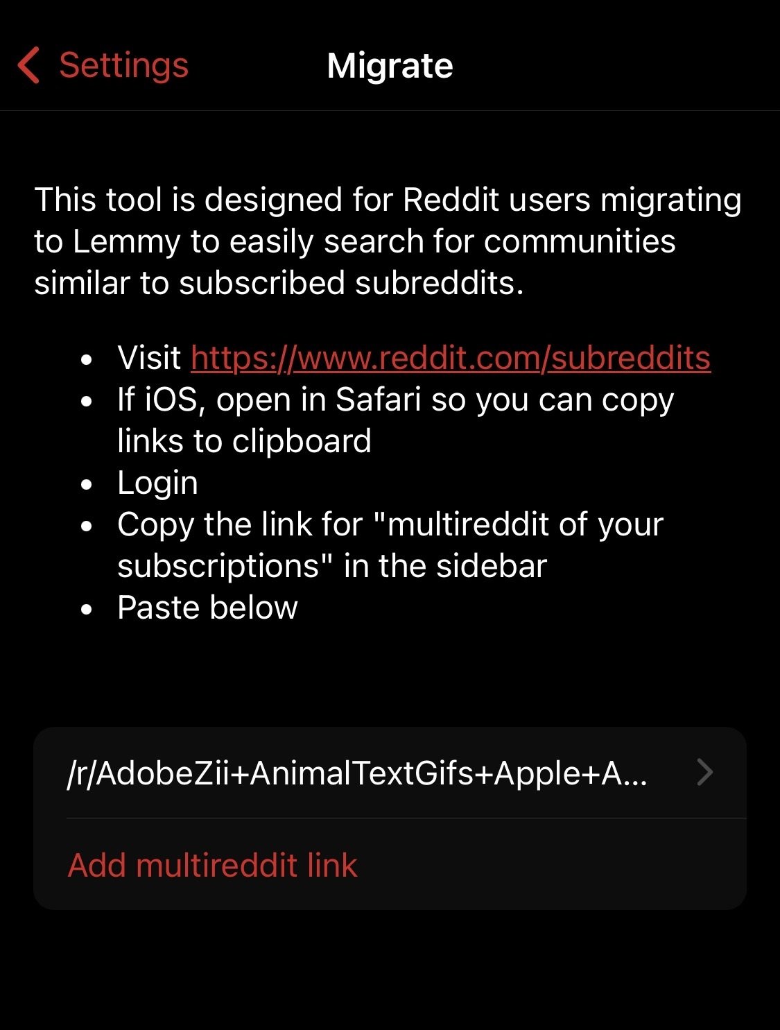
Here’s your answer: “Lemmy wouldn’t really takeoff to replace Reddit until it’s content is search indexable”

I just want to follow normal behaviour that’s also not individual to me if I am the only one to dig through settings and toggle the option because I learnt it here while others go on without it which may influence my perspective being one sided.
I am actually quite an active person no matter where I go, people keep complaining with frustrations even that this is bad and this is worse or this is convoluted but not exactly express why is it bad, where is it bad or how is it bad and can be improved instead of being crticial in the comments section whenever a discussion trends in an unrelated community or thread like c/AskLemmy recently for example, and still no efforts are made to visit the respective community and give their thoughts which is especially more clear if you’re humble and eager enough to hear my thoughts which is so respectful in my humble opinion.
I can understand the 3D Touch being lacking in newer phones hence why I suggested to continue using single tap for collapsing comments, double tap for upvote, and haptic touch to open the menu and select an option without lifting the finger at one go so the menu itself can become smaller. This was a show of understanding to declutter where you can even add triple tap for copying all text (without selection) as example while the one via menu shows select text option while keeping the list minimum.
Earlier, the icons were non-interactive element but since we have left gesture to go back layer wise, single tap on menu icons itself should directly reset to the main screen.
Link previews are still needed for posts and such, it’s just that it doesn’t make sense everywhere like the references in comments.
No, but I recently joined Lemmy and rather surprised this all have gone unnoticed given that you’re quite an active developer. However, Voyager community is much active if you were wondering.
Device: iPhone X
Version: iOS 16.7.10
All of them are not necessarily bugs like when tapping the icon (say inbox) in the bottom panel doesn’t directly exit to the mainscreen from this comment thread for example which is universal whether you’re on a news app, rss feeder, AppStore or reddit where even on websites tapping home would directly lead one to the homepage but here (Posts) it doesn’t which is odd.
As long as it’s into consideration and not forgotten.
What am saying is, do we really need link previews? Also, haptic touch on hyperlinks is inconsistent or not optimised which immediately opens up the default browser.
If I were your business partner in a story, I would have said this would only help Arctic to become more exclusive and preferred over anything out there by popular choice since no one’s going to complain a standard practice and may even one day force Lemmy’s mind to prefer Arctic over Voyager rules if we keep going like this.
Anyways, can we fix this?

Regarding Numbered List: While making a response, the numbering stays right during editing mode - something to take note of that it can be fixed as I would be looking forward to subnumbered list like 1.1 → 1.2 next, instead of just 1 → 2
Here’s reddit markdown wiki which is a good reference to bookmark for across all internet to follow in a synchronised manner.
↳ Personally, I would restrict italics to only _italics_ and bold to *bold*
One thing however I don’t understand is the nature of spoiler here as opposed to anywhere else including reddit itself, the one on Lemmy is more like collapsible menu items than a spoiler. If you’re fixing the spoiler back to normal then I would request to rename the current spoiler system to something else which is good for sidebar rules but not really as a spoiler itself in comments.
!spoiler!<
::: menu Title Text :::
Looking forward to the changes. ✌︎
^Also, looks like link previews have the same problem as images.^
I am glad and nice to meet you, after witnessing your dedication first hand I would also like to try my part in bringing more exposure to your client here on forward and I hope my feedback can also bring forth the same support from others. If it’s preferable, we can directly interact in DMs to keep tab of everything at one place and would be happy to contribute further.
✓ ↻ <gap> 💬 <gap> ↑420 ↓69
return (enter) while pressing the shift button to introduce paragraph breaks inside the bullets and numbering just like the desktop site.


I am not really sure, iOS 13 I suppose?