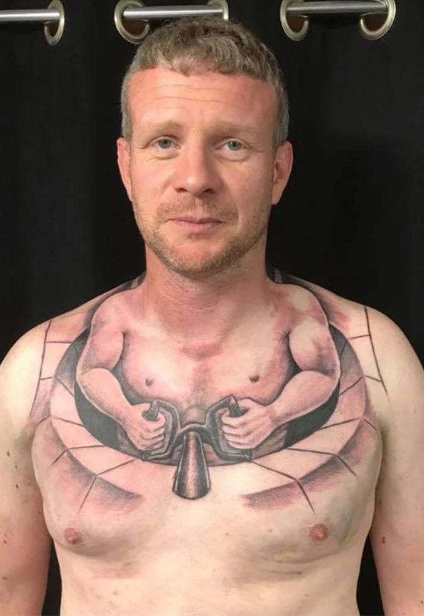
LaserM to Shitty/Trashy TattoosEnglish · 15 days agoWalk*imagemessage-square8linkfedilinkarrow-up146arrow-down12
arrow-up144arrow-down1imageWalk*LaserM to Shitty/Trashy TattoosEnglish · 15 days agomessage-square8linkfedilink
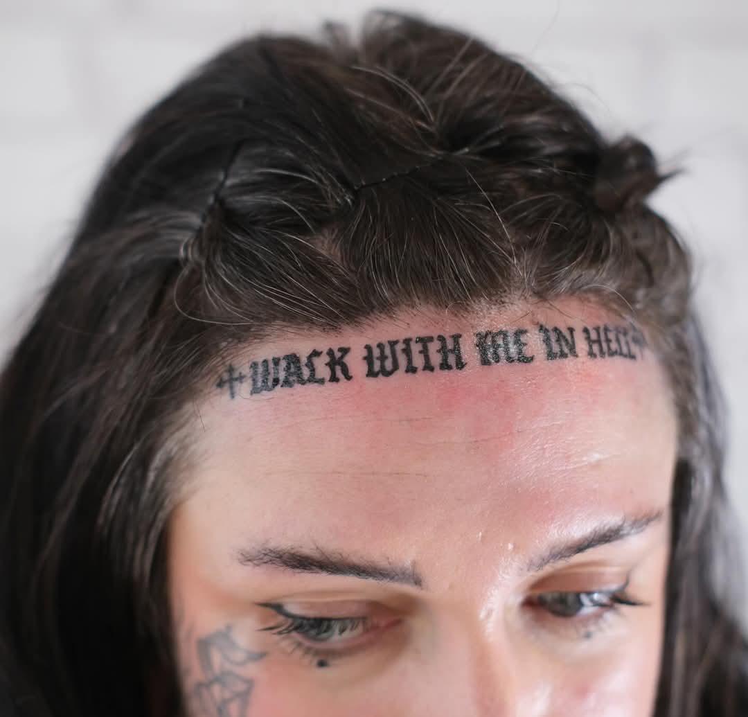
minus-squareHikingVetlinkfedilinkarrow-up7·15 days agoIf your letter can easily be mistaken as another letter, your font failed. I and J not withstanding, though they get the side eye.
minus-squareDon Antonio Magino@feddit.nllinkfedilinkarrow-up3·edit-215 days agoGothic handwriting and fonts aren’t meant to be in all caps, anyway. Here too it isn’t the font’s fault, but that of the user of the font.

If your letter can easily be mistaken as another letter, your font failed. I and J not withstanding, though they get the side eye.
Gothic handwriting and fonts aren’t meant to be in all caps, anyway. Here too it isn’t the font’s fault, but that of the user of the font.