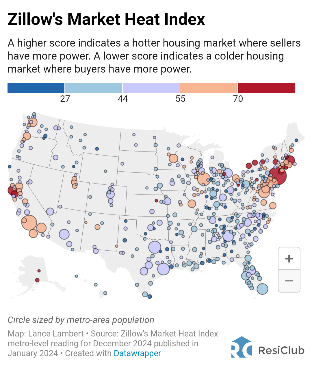
This doesn’t indicate ‘where people want to buy houses’.
Red indicates areas that have large numbers of interested buyers per unit, low supply levels, low time on market, some combination of that, which indicates that sellers have the ability to set the price in negotiations.
Blue indicates areas that have low numbers of interested buyers per unit, high supply levels, high time on market, some combination of that, which indicates buyers have more power in price negotiations.
The sizes of the circles only indicate the population of the area, not unsold home supply, not home sales in a given period, just the population of that area.
EDIT:
‘Where people want to buy houses’ would be… maybe approximated by number of pending sales or sales entertaining active bids, divided by the overall area population, or overall homes on market.
Or just polling people per location and asking them ‘do you want to buy a home here?’.
EDIT 2: I randomly watched an interview on youtube that actually explained this and a bunch of other more up to date info, earlier today.
Basically, the housing bubble in many areas may finally actually be starting to let out some air… sales are extremely low, inventory is extremely high, time on market is extremely high, and sellers are actually starting to cut prices to try to find buyers.
Also worth mentioning OPs image shows Dec 2024 data.
Jan 25 data is almost certainly already compiled and available to people in the industry by now, if it isn’t available publically … pretty sure the video i linked has such.
This doesn’t indicate ‘where people want to buy houses’.
Red indicates areas that have large numbers of interested buyers per unit, low supply levels, low time on market, some combination of that, which indicates that sellers have the ability to set the price in negotiations.
Blue indicates areas that have low numbers of interested buyers per unit, high supply levels, high time on market, some combination of that, which indicates buyers have more power in price negotiations.
The sizes of the circles only indicate the population of the area, not unsold home supply, not home sales in a given period, just the population of that area.
EDIT:
‘Where people want to buy houses’ would be… maybe approximated by number of pending sales or sales entertaining active bids, divided by the overall area population, or overall homes on market.
Or just polling people per location and asking them ‘do you want to buy a home here?’.
EDIT 2: I randomly watched an interview on youtube that actually explained this and a bunch of other more up to date info, earlier today.
Basically, the housing bubble in many areas may finally actually be starting to let out some air… sales are extremely low, inventory is extremely high, time on market is extremely high, and sellers are actually starting to cut prices to try to find buyers.
https://www.youtube.com/watch?v=qvnDGRf_Q8M
EDIT 3:
Also worth mentioning OPs image shows Dec 2024 data.
Jan 25 data is almost certainly already compiled and available to people in the industry by now, if it isn’t available publically … pretty sure the video i linked has such.