
It seems like OneUI 6 is coming soon. However with the screenshots of the control centre UI, it seems like the ‘one handed’ UI focus is disappearing as more UI elements are brought higher…
It seems like OneUI 6 is coming soon. However with the screenshots of the control centre UI, it seems like the ‘one handed’ UI focus is disappearing as more UI elements are brought higher…
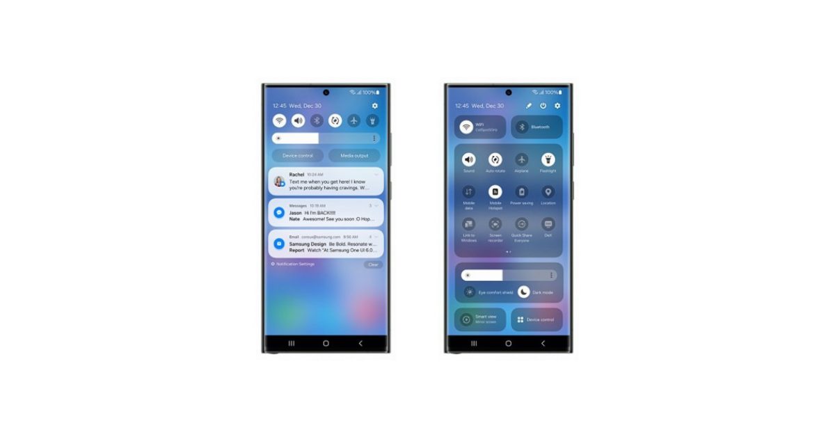
Normally, I’d agree with you. Samsung does put some stupid bloatware apps that you have to disable (which I understand is not the same as uninstalling). But in this case I think that Samsung’s quick settings are better than stock which looks like this. The amount of space wasted there is insane.
Exactly this. Also, Samsung built a lot of functionality into the OS and did it better than Google in many cases.
I think Samsung has done an awful job on their UI. I can’t place why, I just hate it.
I think OnePlus has done really well, keeping close to stock Android but improving on it too.
Hmm. What you’ve posted isn’t far off Samsung’s shade, except for some weirdly wide buttons at the top and a media controller that doesn’t add anything to the experience.
Yes it’s got minor but not insignificant aesthetic differences, but to say Samsung’s is awful and then hold this up as an example of good design… 🤔
Here’s my Samsung’s shade in its two positions (which can be changed to open fully on the first swipe if preferred).
You can just remove those device and media control buttons from the quick panel layout.
I was referring to the weirdly wide buttons on his shade, not mine. :)
Samsung’s quick settings is okay, I should’ve clarified. I just think the rest of their UI sucks ass
Tbf this looks extremely close to Samsung’s layout but with an added widget and long buttons which are like Google’s, which I think waste space.
[This comment has been deleted by an automated system]