From the article:

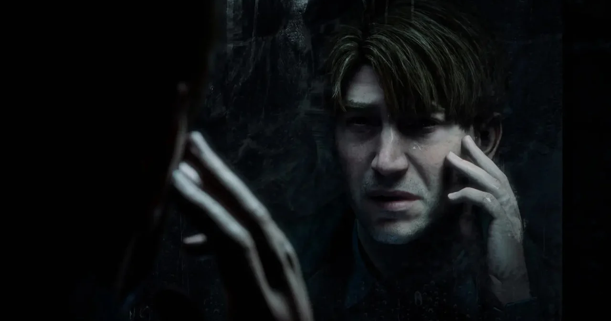
On the whole, Bloober’s Silent Hill 2 sometimes seems more… visually led than it should. There’s an innocent airiness and spaciousness to it, for all the shadows and grime, with puddles that grandly reflect the clouds and sumptuously imagined interiors that speak to an antiquated fixation with extravagant lighting effects and photorealistic fine-detailing for its own sake.

  • Archelon@lemmy.world
    link
    fedilink
    English
    arrow-up
    18
    ·
    3 months ago

    Later in the article:

    I’m writing about the Silent Hill 2 Remake in this scrambled, back-to-front, obnoxious way partly to piss off whoever edits this (to be 100% clear, Team Silent are the creators of the original Silent Hill 2, which Bloober are remaking), and partly to make a point about remakes: that they tacitly or openly position the original game as an “obsolete” museum piece in need of replacement, dismissing the old artistic choices as primitive and incomplete, re-defining the old creative parameters as constraints that need to be lifted. It’s all in the service of the market’s cannibalistic mania for the new, its structural need to ceaselessly bury “the past”, often by directly obstructing non-commercial preservation efforts, and sell you Progress that starts to wither and fade the second you peel away the cellophane.

      • LyD
        link
        fedilink
        English
        arrow-up
        5
        ·
        edit-2
        3 months ago

        This is RPS’s style, you don’t have to like it but it definitely fits in.