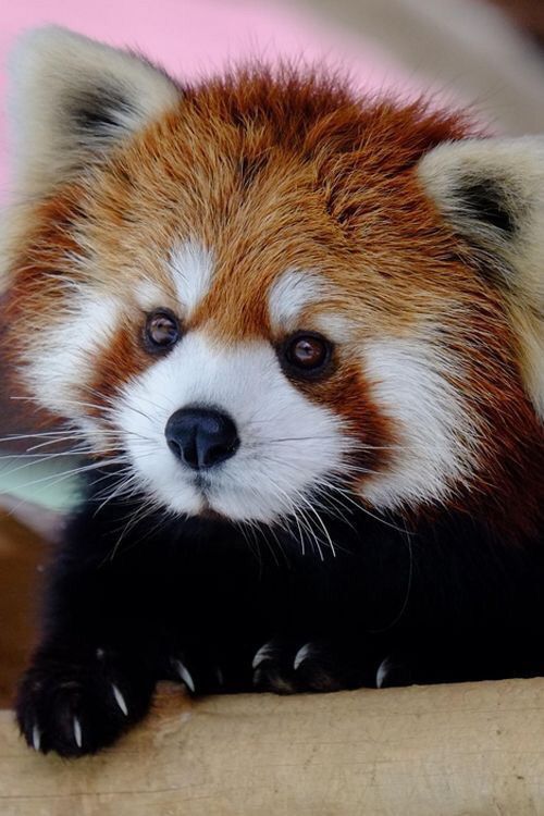
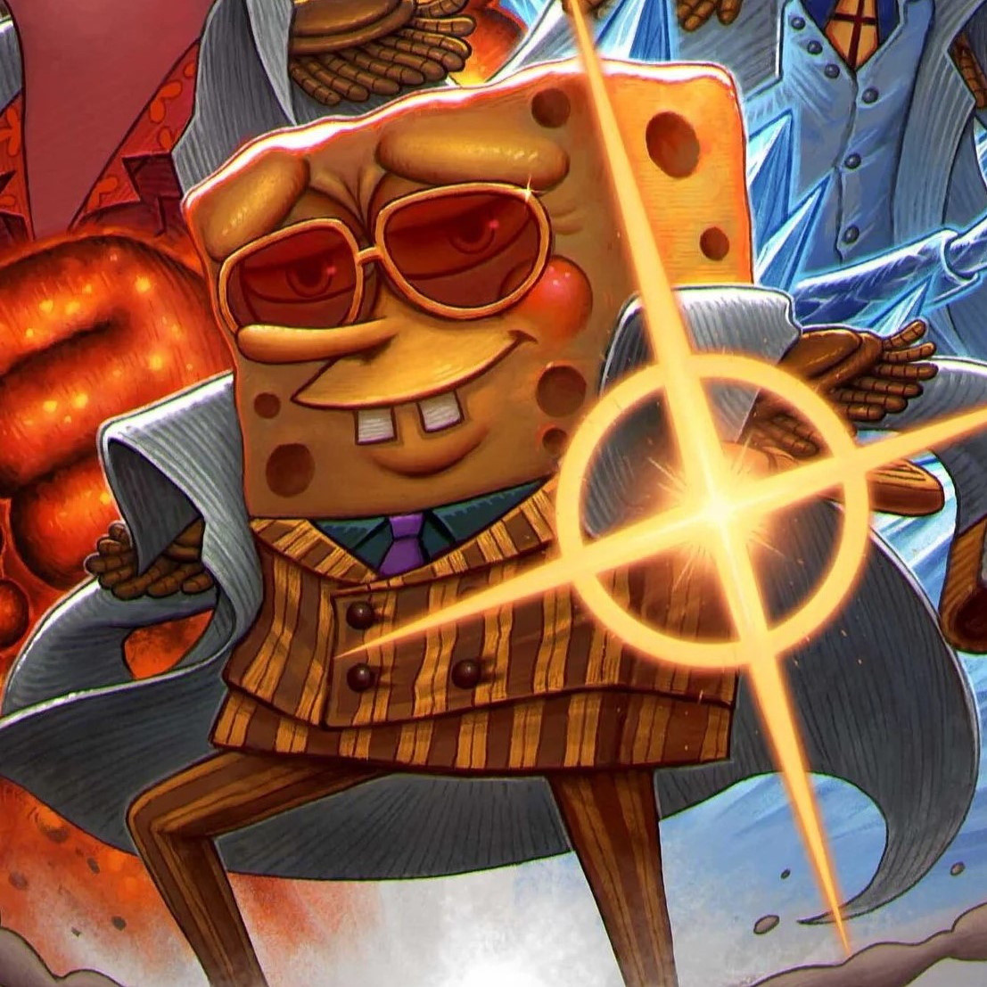
I’m feeling nostalgic for the happy blue lemming icon with the red nose.
Agreed. The new one is boooring. It literally looks like something your OS designated as an icon for an app that doesn’t have an icon. It’s like a placeholder.
It straight up looks like Samsung’s browser icon
I respect this opinion.
Agree, he’s really cute!
+1
Really liked the icon
Yes please! I loved the original icon!
They are actually looking for someone to design a new icon with a cute “badger” if anyone is up for it. Hop over on the discord to get some one info
Yes!
Now the name Memmy makes a lot more sense!
How come?
Picture looks like a baby, who would say ‘Memmy’. Just too cute.
This was the first icon right? I’ve forgotten whether it was this one or the black and white one.
Yeah there was an older black and white one, I think it was literally just the Lemmy logo.
I dont like the original, to be honest. But the new one is pretty improvable
Can change the icon to whatever you want I think. Android can tap and hold to open the edit menu. IPhone has some type of shortcut thingy to change it.
What about the same tack as one of the other apps where you can upload your own icon? Make it whatever you want?
I have never understood why people put so much stock in icons. It’s like people getting upset over the new pixelated reddit icon. It’s all reminiscent of the custom ring tones and call back song that people used to obsess over.
I like clean looking UIs with consistency, having an app that has a windows 95 looking icon while the rest of the Home Screen has icons that are at least in the same design language looks off
It’s basically the same kinda shit in real life, maybe you personally have a beard and like the way it looks while others think it looks like crap, insert basically anything in life, wall paint, cars you like etc…
Turns out it’s expensive to get one of those good icons!
And the newest icons look great I can understand why
But the beard and your clothes are all things you control. You don’t expect someone to change their looks for you. So likewise you shouldn’t be expecting developers to meet your stylistic demands.
I guess you missed the point, everyone alive has preferences is what I was getting at.
I’m not expecting developers to meet my stylistic demands, I like the icon I’m not asking for a change
Well that’s it then. You download it you want control.
