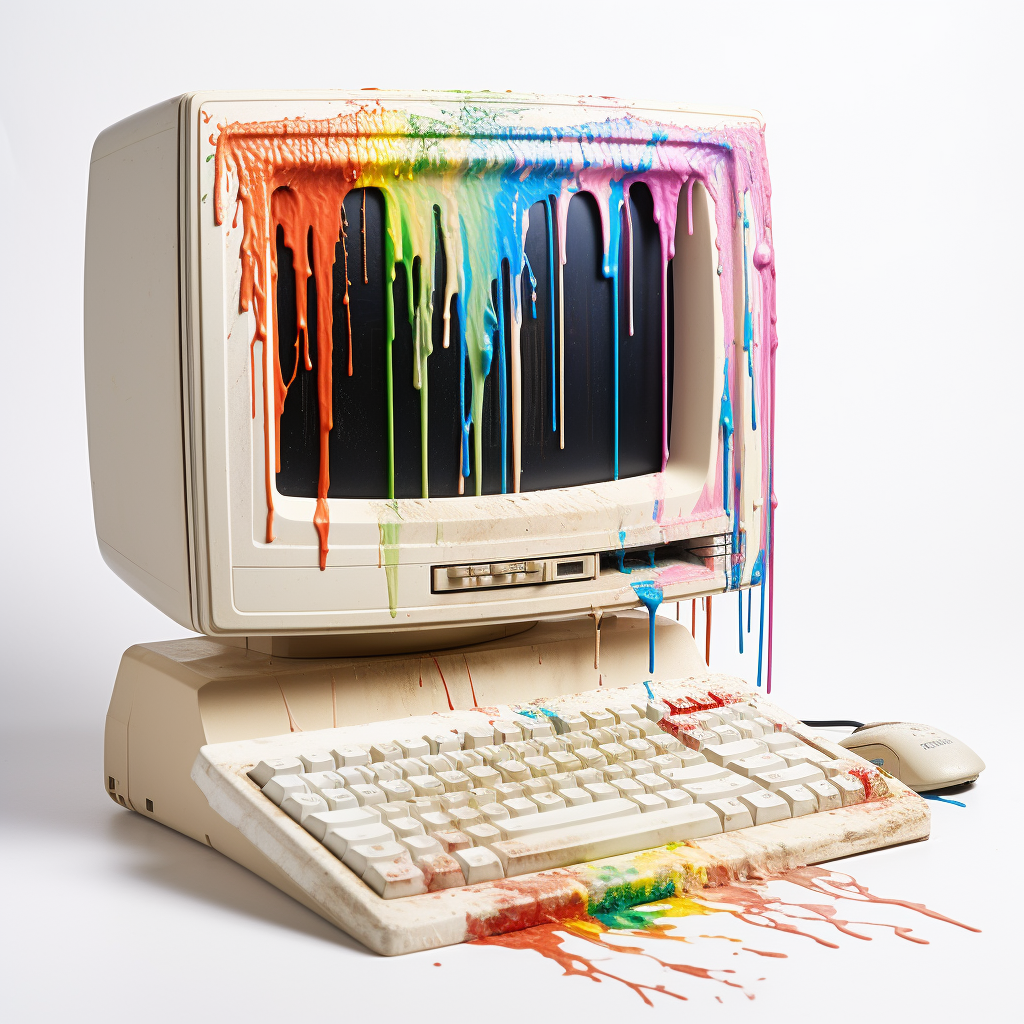
Keep it simple, stupid
Follow the rule of KISS, try to create something simplistic, minimalistic, and reductionistic.
They do not have to be line drawings like the example image, but they can be if you want.
Prompt for post image:
Rules
-
Follow the community’s rules above all else
-
One comment and image per user
-
Embed image directly in the post (no external link)
-
Workflow/Prompt sharing encouraged (we’re all here for fun)
-
At the end of the week each post will be scored according to the following grid
Prize Points Most upvoted +3 points Second most upvoted +1 point Theme is clear +1 point OP’s favorite (me, this week) +1 point Most original +1 point Last entry (to compensate for less time to vote) +1 point Prompt and workflow included +1 point -
Posts that are ex aequo (tied) will both get the points
-
Winner gets to pick next theme! Good luck everyone and have fun!
Past entries
- Dieselpunk
- Goosebump Book
- Deep Space Wonders
- Fairy Tales
- A New Sport
- Monsters are Back to School
- War and Peace
- Distant lands
- Unreal Cartoons
- Sustainable Ecumenopolis
- Masks
- Mascots
- Old Gods, New Jobs
- Winter Festivities
- High Tech, Low Life
- Character Limit
- Gatsby’s Jazz Hands
- Reel to Canvas
- Cruelly Cute Characters
- Retro Sci-Fi
- Get Your Bard On!
- Busy Bees: Animals with Jobs
- Mad Royalty


Went back and forth with Bing experimenting with different styles and landed with something I liked.
Runner ups
Sorry you didn’t win this time. I like how your final version feels like one of those scratchy-paper sheets that have the colour underneath, interesting style.
That’s a very apt comparison. It didn’t occur to me while working on this but I do love those so that’s porbbaly why this was the one I selected.