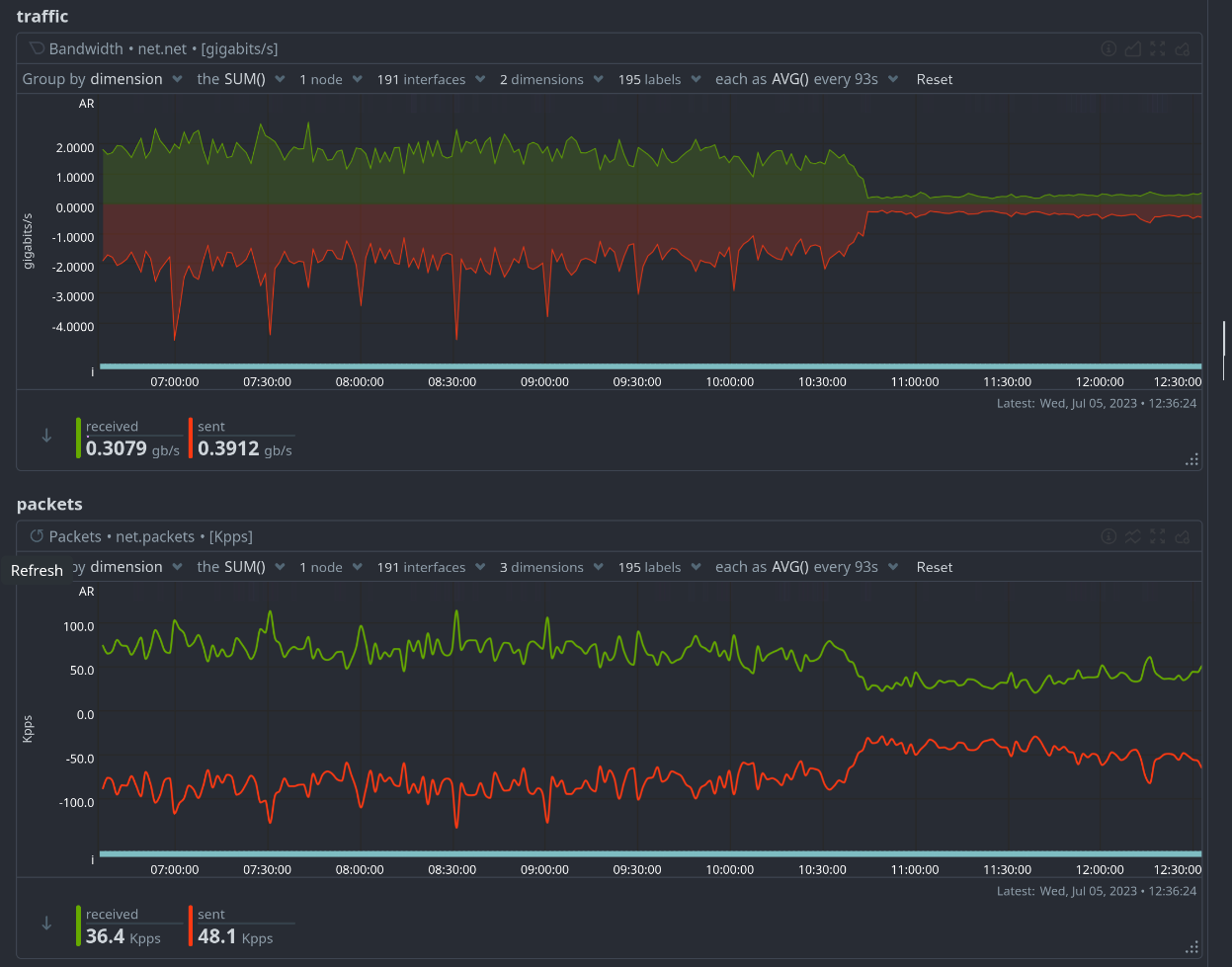
I have pushed forth the latest and greatest Lemmy upgrade as it come with some mind-blowing speed improvements, thanks to the DB query tweaking of @[email protected]
Just check how the load for lemmy.world decreased!

As a result, this instance should feel significantly snappier now. Let me know!


This version is a pleasure to navigate with. My only complain would be that the darkly-red theme is now… blue!
By the way, I noticed that this instance’s blocklist is now empty, we’re linked to previously defederated instances; is it intentional?If you’re looking at
/instances, the blocklist has just been moved to the bottom.not on my end. Are you talking about the background image?
Oh, I read it all wrong then. Sorry 😅
No, the accent color; you know, for the links, buttons, comment window border, etc… All of that’s been changed from a contrasting red to a too discreet blue.
can you show me a screenshot? because for me it looks fine
(Sorry for the late reply)
It seems to be almost be back to normal, the bulk of the interface has its red color now… I’m not complaining, but I can’t make a screenshot now 😅
There are some parts that are still blue or behave weirdly though: