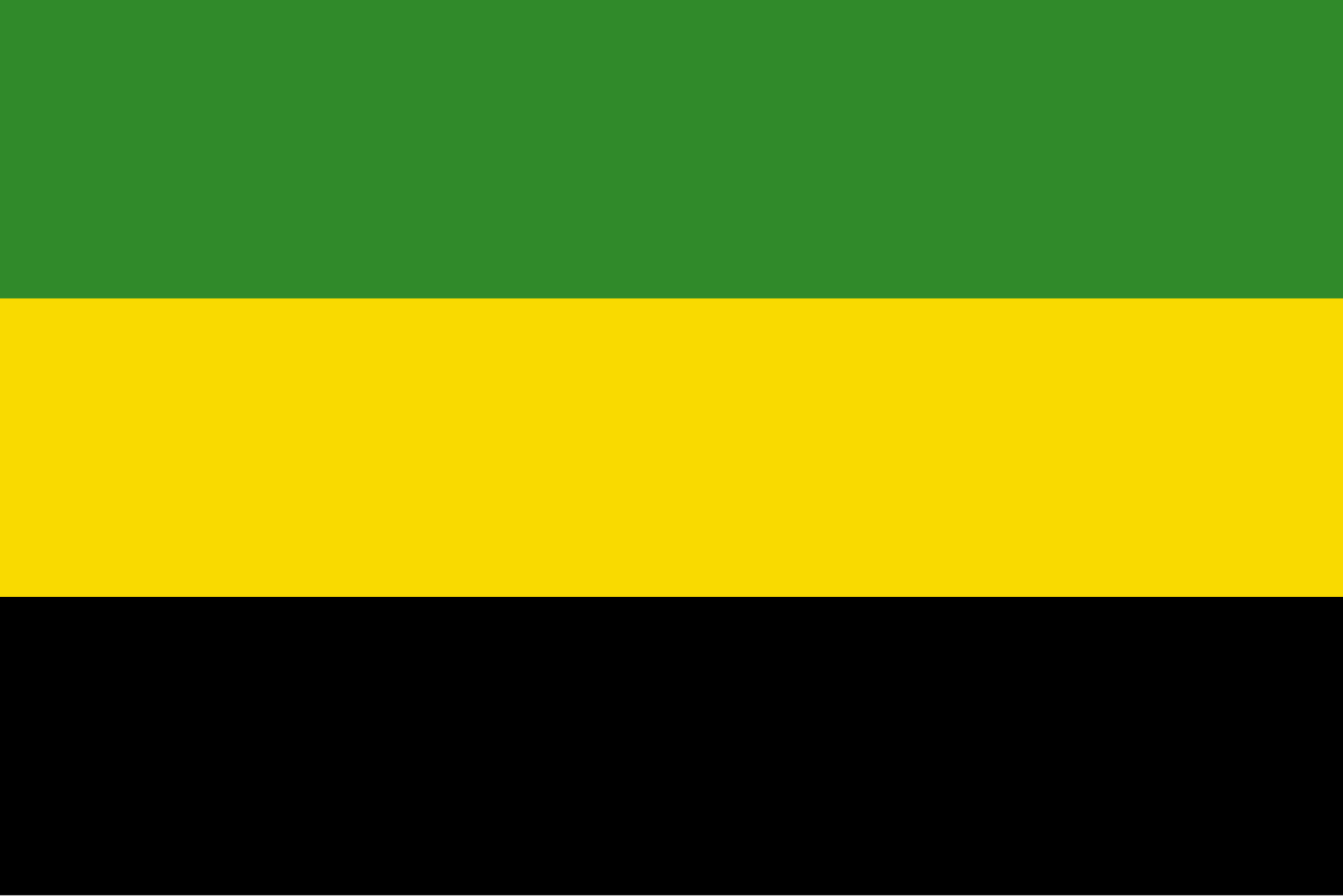
This was an initial proposal, with the same colors in a slightly boring horizontal triband:

Another proposal rearranged it a bit, but was discarded as too similar to the flag of Tanganyika, which seems quite reasonable, since they did not know that problem would be short-lived:

In the end they went for the saltire, which seems like a great choice, creating a more unique and interesting design.


Interesting. Sri Lanka’s flag has teal and maroon, I’d say they aren’t really shades of blue and red. Also Kazakhstan’s flag’s background is cyan, not really blue. Distinction between colours and shades is a cultural thing.