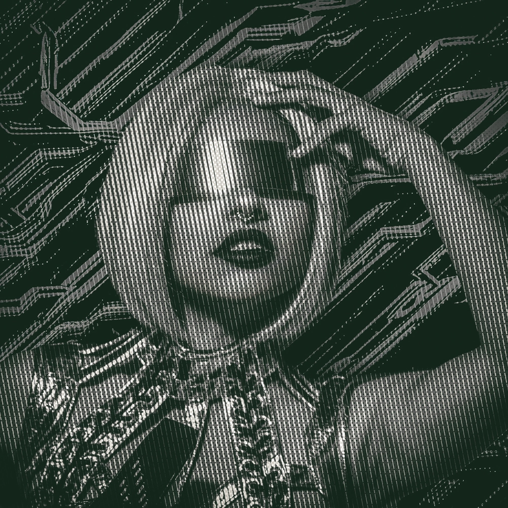
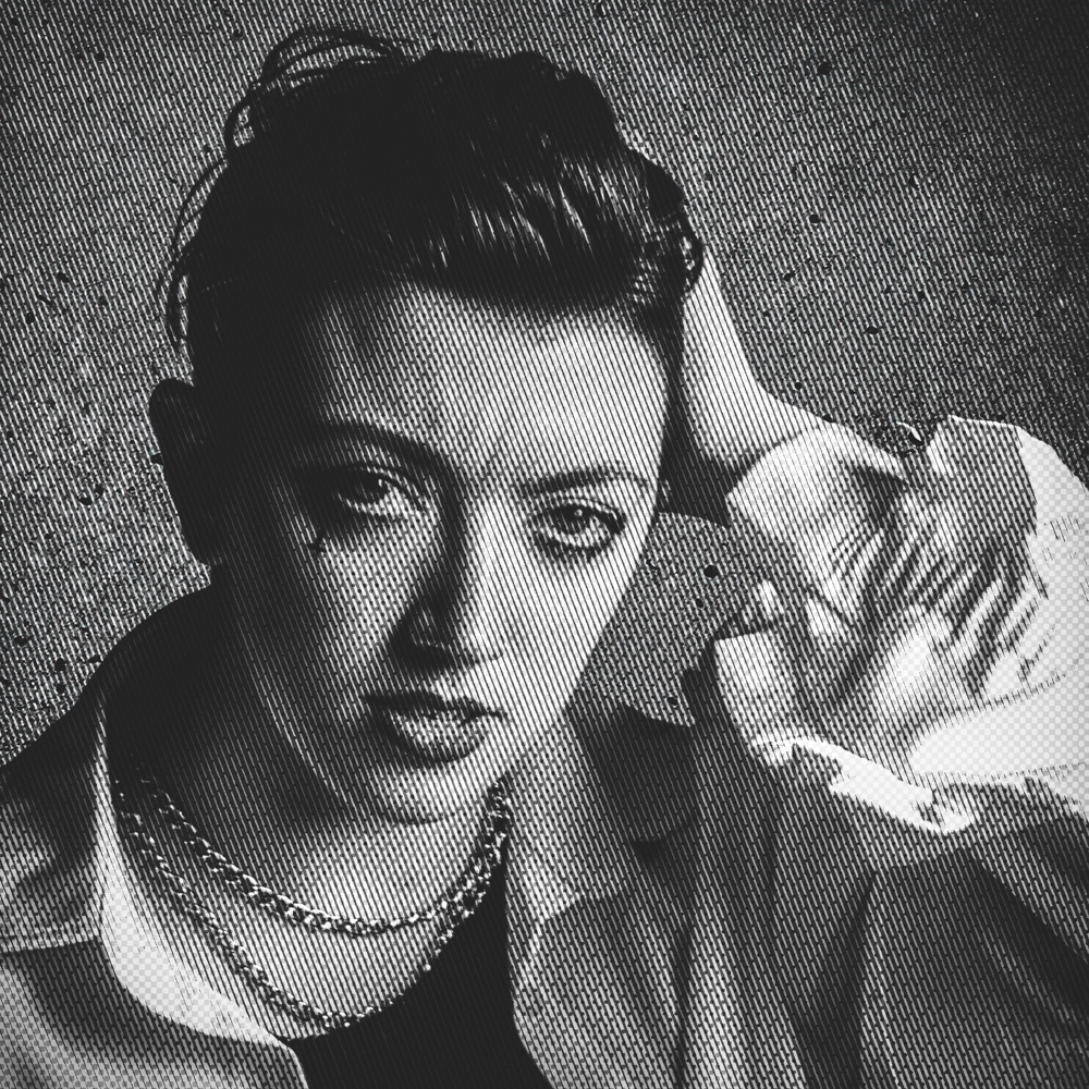
I’m working on this graphic treatment for fun stylized portraits. What do we think?
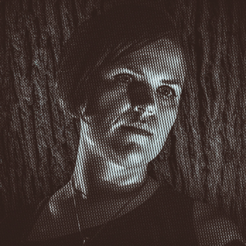
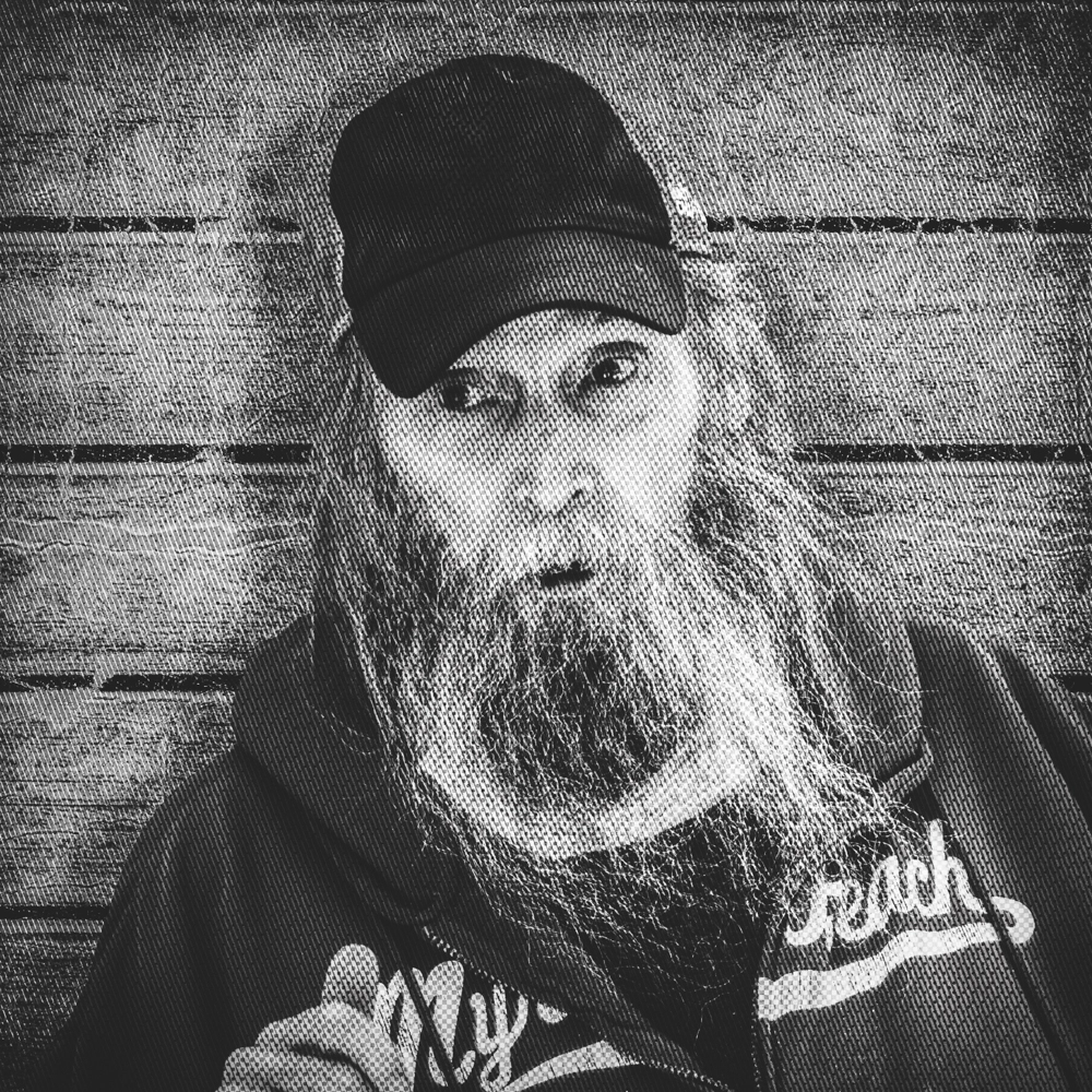
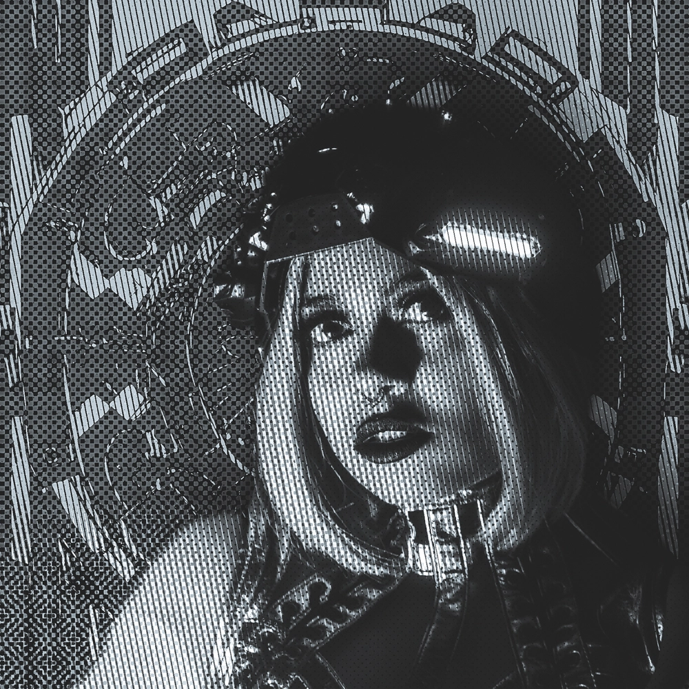
I think it looks especially good with the first 2, where we have lots of texture to play with. In that sense, I think it feels more at-home with the backgrounds there.
Interesting and pleasing effects. How are you achieving it? My guess would be two main layers (photo and pattern) and some clever interactions with blurred versions of the main photo and the pattern?
To me it seems likely you were careful in choosing the angle of the pattern - I assume your technique can cope with rotating said pattern for a main photo calling for it.
One layer for stripes, one for dots, one for a drop shadow (when it’s necessary). And yes, I like 260 degrees but it can take other angles as well.