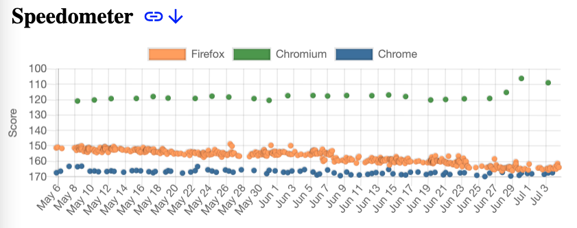
May and June were good months for Firefox’s Speedometer performance compared to Chrome. We’re closing in while Chrome seems fairly static. In this visualization, lower in the graph is better. From https://arewefastyet.com/win10/benchmarks/overview?numDays=60.
It is nice to see the improvements.
As a firefox user though I feel it has been “fast enough” for a while. My main gripe is developers basically only optimize for Chrome now. The last one I bumped into was ElasticSearch’s Kibana application. Atrocious load time on Firefox, pretty quick on Chrome.
Still Firefox’s containers and proper ad block are killer features for me so I am unlikely to move away as long as features like those are functional.
Also I know tons of people online complain about FireFox Mobile but I use it on android and think the experience is pretty good.
It seems like an odd choice to put bigger numbers lower down, when we generally associate them with up. Any idea why it’s visualized that way?
Could be a score about time. Small numbers = faster = better = up.
I think it is so that on all graphs “lower” down is better. But agree it’s kind of unusual layout. Looking at the graphs for Linux i wonder what happened in feb 11:th this year - where all values for Firefox got a lot worse.
Sometimes the hardware or software configurations of the machines running the tests changes, or a bug in the test harness itself is fixed, which can skew all of the results at once.
