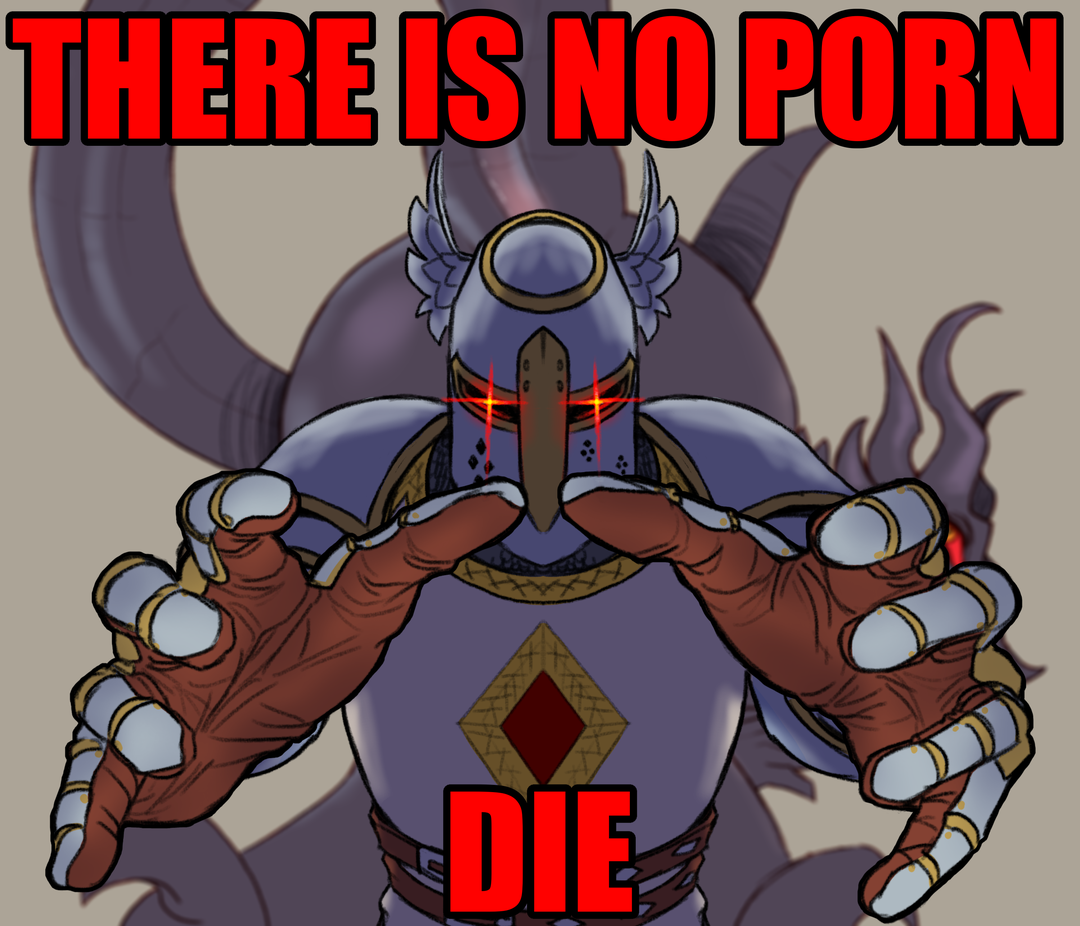
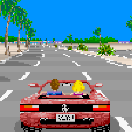
I remember playing Doom for the first time and I remember thinking that graphics would never get any better than that. Like the arm even moves when he walks!
How horribly naïve I was.
5 year old me thought it looked photorealistic.
That was Mortal Kombat when I was 15
But mortal Kombat WAS photorealistic (in my head)
They did have people dress as the fighters and do poses and then took photos of them and turned these photos into sprites.
So the game was photorealistic (that is within the technological boundaries of the platforms the game ran on).
I’d love to see a 2D Mortal Kombat with the original photos taken from what we may consider the OG Mortal Kombat cosplayers.
It still is in my head… Didn’t they use real photos/video for the animation?
I think it was the first use of motion capture in a video game.
It made Street Fighter look so cartoony and childish by comparison.
I remember Altered Beast having amazing graphics, but it was just memory goggles. I was very disappointed when I got around to firing it up in an emulator.
Same, basically every game I played as a kid has awful graphics compared to modern stuff
Primal Rage too for me. “Stop motion animation? In a game? This is the height of technology!”
Heh I thought the same with Max Payne. (the first one)
I remember feeling the same way with Myst. “It even has video!”
My peak game i think it was F.E.A.R., my pc couldn’t run it at full but I remember thinking it couldn’t possibly get any better than that
In some ways it didn’t.
No microtransaccions, no battle pass, just a nice story to tell through a videogame, awesome soundtrack also
grew up with c64, spectrum+3, master system, genesis, nes, snes. So when I bought a ps1 with my paper round money and started up the intro to Soul Blade, that would become Soul Calibur, the graphics jump shook me to my core and brought tears to my eyes. I was like "THIS is the peak of graphics. Nothing can beat this.
Here’s the video: https://www.youtube.com/watch?v=5Jscuco8zEk
Here is an alternative Piped link(s): https://piped.video/watch?v=5Jscuco8zEk
Piped is a privacy-respecting open-source alternative frontend to YouTube.
I’m open-source, check me out at GitHub.
I mean that looks legit. I’ve got no nostalgia at play here, having never seen that intro before.
I had those moments multiple times. I remember thinking the same about International Karate on the Amiga. Then my mind was blown with Street Fighter II, Max Payne was one for sure as mentioned elsewhere and let’s not forget Carmageddon, which got a little bit too realistic. Graphics technology developed so fast, you can’t compare it to today’s upgrades. As I’m older now 10 year old games still feel “new” to me.
As I’m older now 10 year old games still feel “new” to me.
It’s not just you getting older, it’s also diminishing returns.
It takes more and more effort, both in manpower as in graphical processing power, to make graphical leaps, and the visible returns are getting less.
You can compare it to video formats:
- VHS => DVD: huge quality upgrade
- DVD => 1080p HD: yeah that definitely looks better
- 1080p => 4k: I guess it’s a little sharper?
- 4k => 8k: Well it’s … more. Also: why is everything running so hot?
Well, 8k is in allmost all home-usecases useless, 4k a better choice. Except maybe for video walls. Eye resolution is limited by angular resolution (visual acuity).
I actually liked 3D movies and I even bought the Nvidia 3D kit to play my PC games in 3D, it was amazing (to me)!
But it was an imperfect 3D technology that gave many people headaches, so I can understand why it eventually got scrapped.
I do have a VR headset too, but besides Half-Life Alyx, there haven’t really been any VR games I am so hyped for that I keep going back to play in VR.
Agreed. I used to be blown away by a game from a technical standpoint 2-3 times per console generation and at a similar clip on the PC side. Now we are getting GTA V and Skyrim re-released for the 10th time. Neither of those games were groundbreaking at the time (IMO) as they both were good but predictable progressions from their previous entries.
Playing DKC and seeing the detailed sprites, Mario 64 (and several others) ushering in 3D, the FMVs in FF VII, and the enemy AI in FEAR, these things felt like monumental leaps forward. Nowadays, the closest thing I can think of is something like Elden Ring or TotK which to me is just taking an existing good game (Dark Souls/BotW) and slapping a mechanic onto it (Open world/crafting). They are both excellent games, but neither compare to the leap forward of FF VII or Mario 64.
Maybe I’m just jaded by adulthood and have my rose tinted glasses on.
@lobut I thought Donkey Kong Country on the SNES was photorealistic and rivaled movies like Terminator 2, which used the same technology behind the scenes. I thought every game would look the same as Donkey Kong Country in future.
I remember getting deep into that game, trying to make my own levels with megs of RAM and having things crash. Changing all the sprites on some of the mobs, recording my own sounds and replacing various noises in the game. I learned how to strafe using 100& keyboard (couldn’t look up or down in that game), and dominating the evil. Good time to be a teenager. I still think some of the secret rooms in that game were some of the best.
Same. It was too realistic.
No way would that kid be frowning. If this was legitimately in the late 70s or early 80s that kid would be ecstatic with the graphics.
There, I fixed it!
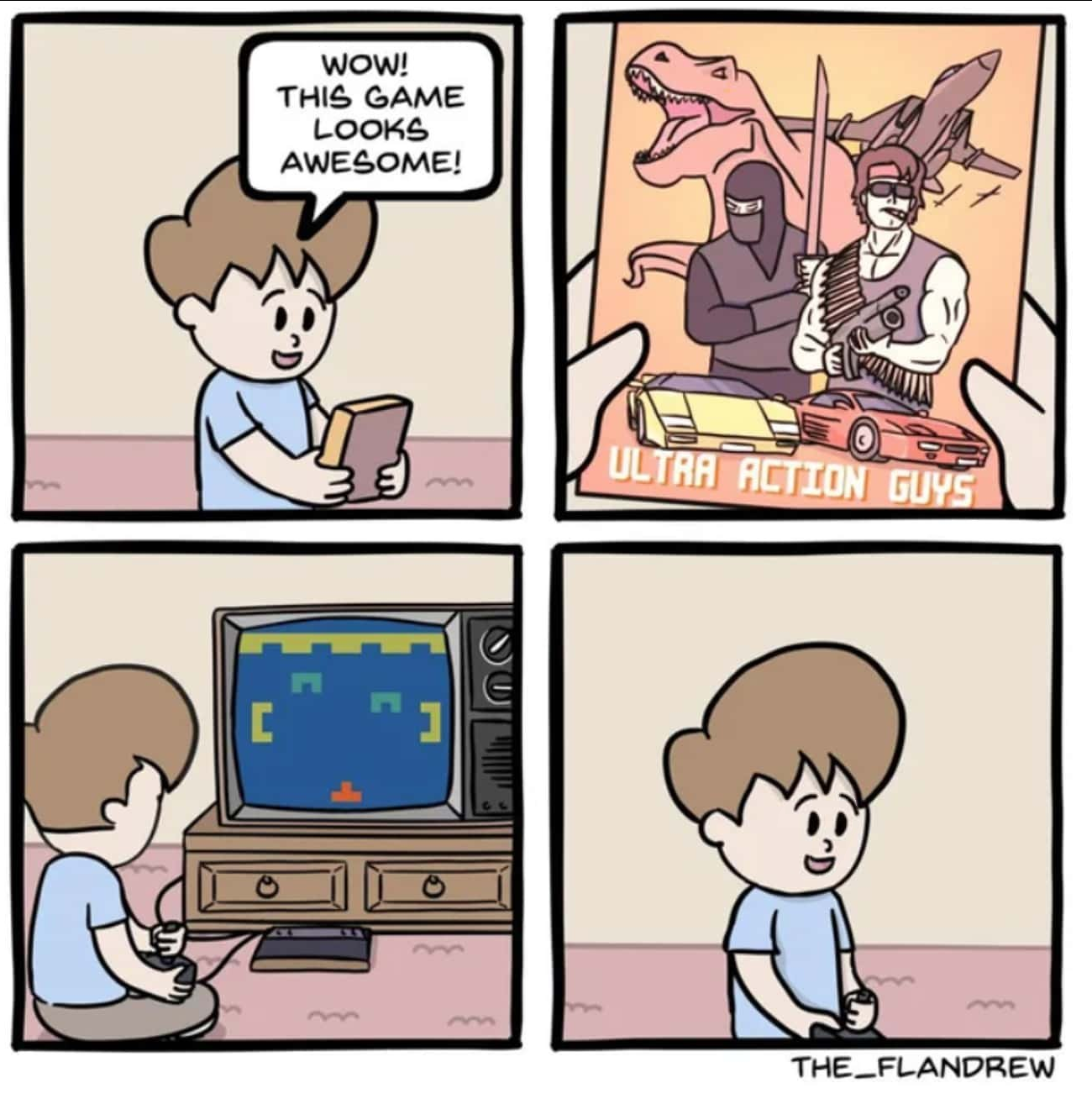
perfect
Always so kick ass
Always?
Have you seen the cover art for the first MegaMan game? lmao
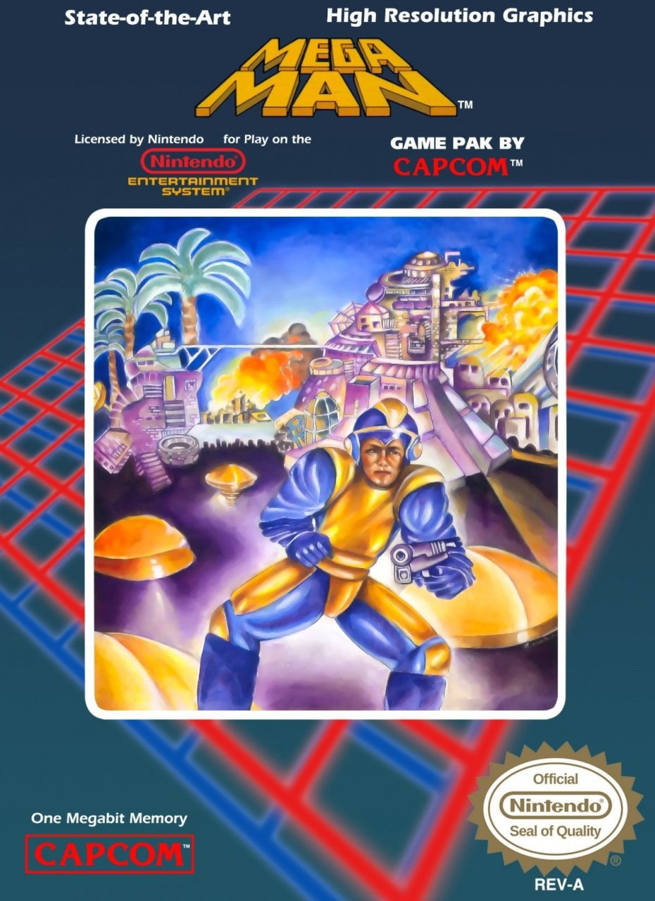
Even funnier with the boasting of “state of the art high resolution graphics” at the top. Though to be fair, the actual game looks infinitely better than that cover.
On the other hand, the European box art is fucking awesome
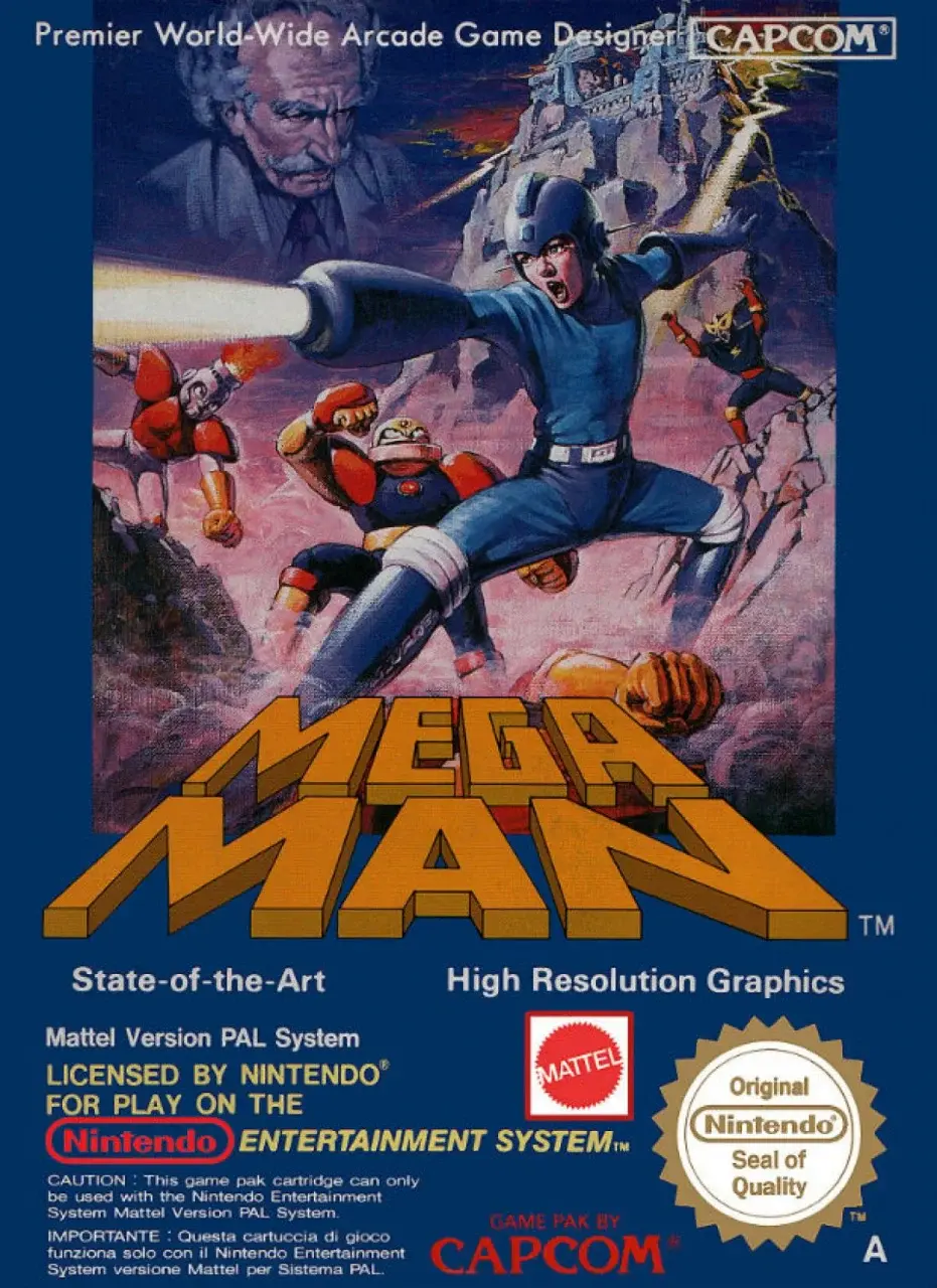
Other than Dr. Wiley lookin’ like fuckin’ Mark Twain, that is pretty sick. Actually, fighting Mark Twain would be sick, too.
I don’t know which I love better
- This isn’t even the right color scheme for the character, so it’s not like they misinterpreted the sprite
- Rock over here looks like he shit himself upon seeing a Mettaur and is trying (and failing) to pretend he didn’t.
- Mega Man doesn’t even use a gun, he uses a Buster. The only time Mega Man has used a gun are instances that parody this boxart or rare occasions like when his internet incarnation uses the Gun Del Sol during crossover events with Boktai
He does make a face like he doesn’t want to be seen in that suit and with his frog legs.
Even funnier with the boasting of “state of the art high resolution graphics” at the top.
At the time, this want really that inaccurate. There weren’t many video games with the same quality.
The only reason it’s laughable now is because it’s been 35 years since the claim was made.
No, it was inaccurate, even at the time. The Famicom was built to cost and and mainly used cheap off-the-shelf components that were already obsolete when the system first released in 1983. The NES released in North America the same year as the Commodore Amiga, a system that actually was cutting edge, and represented a big leap forward in what home computers could do graphically. By the time Mega Man released, the Amiga was on it’s second revision and other home computers were rapidly catching up to it’s capabilities.
While Mega Man was one of the best games on the NES, it ran at the same resolution as every other game on the system, and was stuck working within the same limited color palette and low sprite limit that were more than five years behind the curve when it released.
deleted by creator
Looking at this cover art again now, it kinda reminds me of AI-generated art lol
I love bashing AI art but in AI art it’s usually the details that you spot at second glance that makes it fall apart. The Mega Man cover is just fundamentally messed up to a degree where even AI art is miles ahead.
Yeah true, AI art is more “looks OK at first glance, but smaller details are messed up”, while this one is the opposite of that so “smaller details are actually fine, but as a whole it looks quite messed up” haha
deleted by creator
The american Ico cover is a crime against art


I present Rigby, named after the finest dumbest fucking raccoon ever.
Always loved that they play a Master System.
Not sure, aye. Cartridge slot is on the other side and it’s connected to the TV via RCA with stereo audio. hmm, I can’t think of another console that meets those prerequisites though.
https://images.app.goo.gl/azt6TRq9PVan1tLf6
https://images.app.goo.gl/RZoAy5FSrVDuuGwz6
Mirrored I guess but is it.
My favorite

I love this one. Why is his face off center? Why does he have a normal gun?
The 80s
So many questions…I want to know who paid real money for this
At least in Mega Man 2 he looks like a slightly more normal dude in riot gear with a gun.
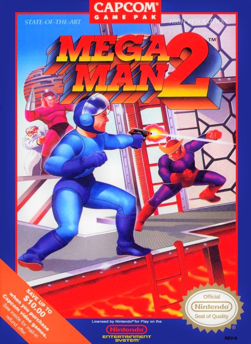
I love that they brought back Bad Box Art Mega Man in Street Fighter x Tekken
How have I never seen this before?
He put all his points into thighs and had none left over for neck.
VHS covers were the same way.
Also, it’s a terrible movie that was on Mystery Science Theater 3000.
It depends on the movie, og terminator VHS slip art is fucking great. Also honorable mention to monty python and the holy grail.
The VHS covers of the 80s-90s Godzilla movies were so good. I still have those tapes for the art.
It was apparently worth the time and money to make four of these movies.
And the star of two of them, Miles O’Keefe, hates the ones he was in. He praised MST3K for being so merciless.
Except in the case of the Sega Master System, where the simplistic 8-bit graphics felt like a massive leap up from the terrible box art!

probably the nostalgia talking, but it was satisfying having all your games look the same on the shelf
The common style is iconic, but that plain grid on a white background is a pretty boring style.
That said it did evoke a little imagination, especially with the manuals.
Ugh, yeah those identical cartridges. The cases they came in had some ok art sometimes, but it was always in the middle of that ugly grid.
deleted by creator
Remember the coverart for Phalanax and how it had NOTHING to do with the game at all? And when asked the company said they simply put a cover they thought would be eyecatching.
Why a random old coot with a banjo on a rocking chair would accomplish that is beyond me
When everything is spaceships and big men with guns. You might ask whats this thing with old man and a banjo?
This is how I feel about mobile games. Even the good mobile games will have some epically animated scene that shows all out war between a bunch of magical badasses with explosions and all kinds of epic shit.
Then the gameplay is some low effort turn based game where the characters barely move and the attack effects are pathetic light shows.
To be fair actually sick effects and attacks would probably take like 30 seconds per turn. Looking at you final fantasy VII
But, I’ve been told my entire life that FFVII is literally the solely greatest thing ever and is itself the 2nd coming of christ its apparently so perfectionly good.
It is. Doesnt mean the turns aren’t long though
30 seconds per turn (…) Final Fantasy
I’m pretty sure that’s minutes, not seconds.
Can’t forget the microtransactions.
Mobile games could have been so much better than they turned out to be.
Last panel inaccurate, games were vibrant and awesome
Just like the ones today that will feel amateurish compared to future immersive games. Give it time
Perhaps like this?

I like this version better!
Games today (also games in the mid 90s) tend to focus on graphics and not as much gameplay, problem with this is that they tend to age poorly, which is why Atari, Famicom, and C64 games are well remembered and still being played to this day but Amiga games aren’t as much, they were primarily designed for graphics and thus look dated today.
It’s also why many Indie games embrace the retro style and game mechanics instead of going for graphical wows. These games are just relevant and enjoyed for longer.
It’s a little less impressive when I got my 8-bit console after 16-bit ones were already out, but that didn’t stop me from playing.
Yeah, I played them a little out of order too, but I never cared as a kid.
deleted by creator
Totally agree. A flashy light show will only keep people’s focus for a hot minute, but good core gameplay will keep players engaged for so much longer. Just look at dwarf fortress, lol.
Battlebit is a good example of this for me - graphics are super basic but it’s fun af and they get the important parts right.
deleted by creator
deleted by creator
deleted by creator
I dunno if that’s the same. VVVVVV at no point indicates it’s supposed to represent anything more complex than what it looks like, it just embraces minimalism as it is.
deleted by creator
A couple of examples from the comments of another post:

Source of the image: Retro 19 – Abu Simbel, Profanation | Commodore Spain
:format(jpg)/f.elconfidencial.com%2Foriginal%2Fc2b%2F58f%2Ffdd%2Fc2b58ffddd6e5f5a2dc1329060c564b6.jpg)
Source of the image: El confidencial
Spanish developers using Alfonso Azpiri’s art for their games is actually genius. If I was a kid in the late 80’s I would have bought game over or R.A.M the moment I saw the cover.
For me the worst was handed down PS1 games with awesome CD art… that just wouldn’t load ☹️
And later we were further deceived with cut-scenes that were so much better than the gameplay.
I never liked those FMVs. They age so badly too, those FMVs looked like a blurry mess when I was playing PS1 games on my PC using an emulator
Ff8’s seamless cinematic to cut-scene swaps were amazing. Ages very poorly, tho.
….which itself gave birth to everyone’s favourite small print .
*not actual gameplay


