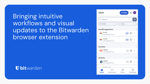
The update is great except for the new “fill” button. Before the update clicking anywhere in a tile would result in filling a form on a page. Now it’s a damn tiny button one must click to autofill a form. It’s extremely annoying.
Making it bigger would be nice
I find it more intuitive now that clicking on a card opens the details menu, but it’s hard to autofill now
The CTRL+SHIFT+L hotkey also stopped working for me, and I’m not sure yet if the issue is with Bitwarden, Firefox, or Zen. I’ll take a look again in a few days, but that should work as an alternative to the tiny button for me
Agreed, that’s kind of an unnecessary pain point. Not the end of the world, but hopefully they continue to improve the UX and that unnecessary friction goes away :)
I’ve written a message regarding this to their support. They’d never know that this is bad if no one gives feedback.
Very true, that’s valuable feedback to provide. I should probably write a message as well, I’d only briefly noticed it yesterday as I was getting something done, so I didn’t really process the change until someone else mentioned they had that frustration
From another thread:
The only thing that really annoys me is the little notification things that pop up over the content. Like I have to wait to copy a password because it’s telling me I’ve just copied a username.
Oh and that it’s now pointlessly doubled the clicks, so to copy a username, instead of clicking the “copy username” icon, you have to click the “copy something” icon and then click “username”. So four clicks to use an entry that isn’t autofilled instead of two.
…
So for me the workflows aren’t particularly improved but I’m glad to see they’re trying to improve things.
I was noticing the notifications before as well, I wish we could adjust the animation time / speed
I like having the confirmation, but I want that notification to launch itself off my screen immediately after
Im on keepassxc i dont trust the internet with my passwords. I dont even trust my server.
The UI is different now, here are the notes about the changes


